Kling IMAGE 4.0

Kling IMAGE 4.0 is an image model for text-to-image and reference-guided generation at native 2K, 4K, and 8K, with natural lighting and skin and material detail close to a camera photo. It renders up to 2,000 characters of legible text in seven languages, combines up to 10 reference images and elements, and plans series of up to 10 images that keep subjects and style consistent. It also designs e-commerce product pages and websites as a single tall image, which suits storyboards, slide decks, product shoots, and campaign visuals.
Text and typography
How to put exact copy on images with Kling IMAGE 4.0: quoting every line, dense layouts, seven languages, named fonts and lettering matched from a reference image.
Introduction
Image models usually treat lettering as texture, so a poster comes back with words that look right and read wrong. Kling IMAGE 4.0 sets the copy you write, up to about 2,000 characters in one image, and keeps it legible at small sizes. That makes a full event schedule or a product spec sheet one request instead of a design job.

A printed poster for a one-day product design conference, in portrait 2:3 orientation, on an off-white background with a single bold cobalt blue circle in the upper right. At the top left, the title "MAKE IT CLEAR" in very large black extended sans-serif capitals on two lines. Below it in medium weight: "A one-day conference on product design that people understand". Then a schedule in a two-column table, times on the left in bold and talks on the right in regular weight: "09:00 Doors open and coffee", "09:30 Naming things so users find them, Priya Raman", "10:15 Error messages that help, Tomás Ferreira", "11:00 Designing empty states, Hana Kobayashi", "11:45 Lunch", "13:00 Writing onboarding that ends, Marcus Webb", "13:45 Forms people finish, Lena Novak", "14:30 Panel: shipping the boring parts", "15:30 Closing notes". At the bottom, in small regular text: "Saturday 14 March 2027, The Linen Hall, 22 Quay Street, Bristol. Tickets at makeitclear.events". Swiss editorial poster design, generous margins, strict grid, every line spelled exactly as written, no other text.
Every line of copy is a quoted string with its own size and position in the prompt. The schedule is nine strings in a two-column table, and the date line at the bottom is set in the smallest size on the page.
This guide covers the request, how to write copy into a prompt, dense layouts with small print, the seven supported languages, the named font library and matching lettering from a reference image. Long-form pages built around text, such as product detail pages, are covered in product pages and websites.
The request
Text needs no extra parameter. The copy goes into positivePrompt with the rest of the description:
import { createClient } from '@runware/sdk'

const client = await createClient({ apiKey: process.env.RUNWARE_API_KEY })
await client.connect()

const [result] = await client.run({
  model: 'klingai:kling-image@4.0',
  positivePrompt: 'A printed poster for a one-day product design conference, in portrait 2:3 orientation, on an off-white background with a single bold cobalt blue circle in the upper right. At the top left, the title "MAKE IT CLEAR" in very large black extended sans-serif capitals on two lines. Below it in medium weight: "A one-day conference on product design that people understand". Then a schedule in a two-column table, times on the left in bold and talks on the right in regular weight: "09:00 Doors open and coffee", "09:30 Naming things so users find them, Priya Raman", "10:15 Error messages that help, Tomás Ferreira", "11:00 Designing empty states, Hana Kobayashi", "11:45 Lunch", "13:00 Writing onboarding that ends, Marcus Webb", "13:45 Forms people finish, Lena Novak", "14:30 Panel: shipping the boring parts", "15:30 Closing notes". At the bottom, in small regular text: "Saturday 14 March 2027, The Linen Hall, 22 Quay Street, Bristol. Tickets at makeitclear.events". Swiss editorial poster design, generous margins, strict grid, every line spelled exactly as written, no other text.',
  width: 1664,
  height: 2496
})
import asyncio
import os
from runware import Runware
async def main():
async with Runware(api_key=os.environ["RUNWARE_API_KEY"]) as client:
results = await client.run({
"model": "klingai:kling-image@4.0",
"positivePrompt": "A printed poster for a one-day product design conference, in portrait 2:3 orientation, on an off-white background with a single bold cobalt blue circle in the upper right. At the top left, the title \"MAKE IT CLEAR\" in very large black extended sans-serif capitals on two lines. Below it in medium weight: \"A one-day conference on product design that people understand\". Then a schedule in a two-column table, times on the left in bold and talks on the right in regular weight: \"09:00 Doors open and coffee\", \"09:30 Naming things so users find them, Priya Raman\", \"10:15 Error messages that help, Tomás Ferreira\", \"11:00 Designing empty states, Hana Kobayashi\", \"11:45 Lunch\", \"13:00 Writing onboarding that ends, Marcus Webb\", \"13:45 Forms people finish, Lena Novak\", \"14:30 Panel: shipping the boring parts\", \"15:30 Closing notes\". At the bottom, in small regular text: \"Saturday 14 March 2027, The Linen Hall, 22 Quay Street, Bristol. Tickets at makeitclear.events\". Swiss editorial poster design, generous margins, strict grid, every line spelled exactly as written, no other text.",
"width": 1664,
"height": 2496
})
asyncio.run(main())curl https://api.runware.ai/v1 \
-H "Authorization: Bearer $RUNWARE_API_KEY" \
-H "Content-Type: application/json" \
-d '[
{
  "taskType": "imageInference",
  "taskUUID": "2f6a8d13-5c7e-4b90-a3d4-8e1f6c2b9a57",
  "model": "klingai:kling-image@4.0",
  "positivePrompt": "A printed poster for a one-day product design conference, in portrait 2:3 orientation, on an off-white background with a single bold cobalt blue circle in the upper right. At the top left, the title \"MAKE IT CLEAR\" in very large black extended sans-serif capitals on two lines. Below it in medium weight: \"A one-day conference on product design that people understand\". Then a schedule in a two-column table, times on the left in bold and talks on the right in regular weight: \"09:00 Doors open and coffee\", \"09:30 Naming things so users find them, Priya Raman\", \"10:15 Error messages that help, Tomás Ferreira\", \"11:00 Designing empty states, Hana Kobayashi\", \"11:45 Lunch\", \"13:00 Writing onboarding that ends, Marcus Webb\", \"13:45 Forms people finish, Lena Novak\", \"14:30 Panel: shipping the boring parts\", \"15:30 Closing notes\". At the bottom, in small regular text: \"Saturday 14 March 2027, The Linen Hall, 22 Quay Street, Bristol. Tickets at makeitclear.events\". Swiss editorial poster design, generous margins, strict grid, every line spelled exactly as written, no other text.",
  "width": 1664,
  "height": 2496
}
]'runware run klingai:kling-image@4.0 \
positivePrompt="A printed poster for a one-day product design conference, in portrait 2:3 orientation, on an off-white background with a single bold cobalt blue circle in the upper right. At the top left, the title \"MAKE IT CLEAR\" in very large black extended sans-serif capitals on two lines. Below it in medium weight: \"A one-day conference on product design that people understand\". Then a schedule in a two-column table, times on the left in bold and talks on the right in regular weight: \"09:00 Doors open and coffee\", \"09:30 Naming things so users find them, Priya Raman\", \"10:15 Error messages that help, Tomás Ferreira\", \"11:00 Designing empty states, Hana Kobayashi\", \"11:45 Lunch\", \"13:00 Writing onboarding that ends, Marcus Webb\", \"13:45 Forms people finish, Lena Novak\", \"14:30 Panel: shipping the boring parts\", \"15:30 Closing notes\". At the bottom, in small regular text: \"Saturday 14 March 2027, The Linen Hall, 22 Quay Street, Bristol. Tickets at makeitclear.events\". Swiss editorial poster design, generous margins, strict grid, every line spelled exactly as written, no other text." \
width=1664 \
height=2496{
"taskType": "imageInference",
"taskUUID": "2f6a8d13-5c7e-4b90-a3d4-8e1f6c2b9a57",
"model": "klingai:kling-image@4.0",
"positivePrompt": "A printed poster for a one-day product design conference, in portrait 2:3 orientation, on an off-white background with a single bold cobalt blue circle in the upper right. At the top left, the title \"MAKE IT CLEAR\" in very large black extended sans-serif capitals on two lines. Below it in medium weight: \"A one-day conference on product design that people understand\". Then a schedule in a two-column table, times on the left in bold and talks on the right in regular weight: \"09:00 Doors open and coffee\", \"09:30 Naming things so users find them, Priya Raman\", \"10:15 Error messages that help, Tomás Ferreira\", \"11:00 Designing empty states, Hana Kobayashi\", \"11:45 Lunch\", \"13:00 Writing onboarding that ends, Marcus Webb\", \"13:45 Forms people finish, Lena Novak\", \"14:30 Panel: shipping the boring parts\", \"15:30 Closing notes\". At the bottom, in small regular text: \"Saturday 14 March 2027, The Linen Hall, 22 Quay Street, Bristol. Tickets at makeitclear.events\". Swiss editorial poster design, generous margins, strict grid, every line spelled exactly as written, no other text.",
"width": 1664,
"height": 2496
}Response
[
  {
    "taskType": "imageInference",
    "taskUUID": "2f6a8d13-5c7e-4b90-a3d4-8e1f6c2b9a57",
    "imageUUID": "9c4b1e7a-3d62-4f85-b0a9-6e2d8c5f1b34",
    "imageURL": "https://im.runware.ai/image/os/a14d18/ws/2/ii/9c4b1e7a-3d62-4f85-b0a9-6e2d8c5f1b34.jpg"
  }
]
Writing the copy
Put each line in double quotes and attach three things to it: where it sits, how large it is and what weight or style it takes. The quotes mark the string as copy to set letter for letter. Without them the model reads the words as a description and paraphrases them.
List the lines in reading order. The poster prompt goes title, subline, schedule, footer. A reader takes them in that same order, so the hierarchy on the page follows the prompt.
Close the prompt with a spelling line: "every line spelled exactly as written, no other text". The first half holds names and numbers to the quoted spelling, and the second stops the model from adding a tagline or a logo of its own.
Dense layouts and small print
Kling IMAGE 4.0 keeps small text legible in crowded layouts. Product infographics and spec sheets depend on that. The power bank sheet below runs from a specs table down to a footnote in very small print, rendered at 4K so the smallest line still has enough pixels:

An e-commerce product information image for a portable power bank, in portrait 3:4 orientation. A matte graphite power bank with a small LED display stands at the top center on a light gray backdrop with a soft shadow. Below it, the title "VOLTA 20 PRO" in bold black sans-serif capitals and the line "20,000 mAh fast-charging power bank" under it. Then a specifications table with thin gray rules and two columns, labels on the left and values on the right: "Capacity: 20,000 mAh / 74 Wh", "Max output: 65 W USB-C PD", "Ports: 2 × USB-C, 1 × USB-A", "Laptop charging: Yes, up to 65 W", "Recharge time: 1 h 45 min with a 65 W charger", "Weight: 380 g", "Size: 152 × 72 × 26 mm", "Airline safe: Under 100 Wh". Under the table, three short feature paragraphs in small text, each with a bold heading: "Charges a laptop" followed by "Powers most 13 to 15 inch laptops through USB-C and tops up a phone at the same time.", then "Shows what is left" followed by "The display shows the remaining charge in percent and the time left at the current load.", then "Built to travel" followed by "Rated under the 100 Wh limit most airlines set for carry-on batteries.". At the very bottom, a footnote in very small gray text: "Charging times measured at 25 °C with the included cable. Actual capacity varies with temperature and load." Clean e-commerce infographic layout, crisp legible small text, every line spelled exactly as written, no other text.
Give small text the resolution it needs. A 4K canvas gives each letter of the footnote, the smallest line on the sheet, four times the pixels a 2K one would, and that margin is what keeps fine print sharp after the image is compressed for a product page.
Structure dense copy the way the layout will show it. "A specifications table with thin gray rules and two columns, labels on the left and values on the right" tells the model how the eight spec lines relate, so they come back aligned instead of as a block of sentences.
Seven languages
Kling IMAGE 4.0 renders text in Simplified Chinese, Traditional Chinese, English, Japanese, Korean, Spanish and Portuguese. The four posts below share one layout prompt and change only the three quoted lines:

A square Instagram post for an online furniture store's summer sale. A low oak lounge chair with a cream bouclé cushion stands on the right half of the frame on a warm sand-colored backdrop, with a soft shadow and a potted olive tree behind it. On the left half, stacked text in a bold geometric sans-serif in dark brown: the headline in very large letters, a subline below it in medium letters, and a call-to-action in a rounded terracotta button at the bottom. Clean flat commercial layout, photoreal product. Headline: "REBAJAS DE VERANO". Subline: "Hasta un 40 % en sillas y sofás". Button: "Comprar ahora". Every line spelled exactly as written, no other text.

A square Instagram post for an online furniture store's summer sale. A low oak lounge chair with a cream bouclé cushion stands on the right half of the frame on a warm sand-colored backdrop, with a soft shadow and a potted olive tree behind it. On the left half, stacked text in a bold geometric sans-serif in dark brown: the headline in very large letters, a subline below it in medium letters, and a call-to-action in a rounded terracotta button at the bottom. Clean flat commercial layout, photoreal product. Headline: "PROMOÇÃO DE VERÃO". Subline: "Até 40% em cadeiras e sofás". Button: "Comprar agora". Every line spelled exactly as written, no other text.

A square Instagram post for an online furniture store's summer sale. A low oak lounge chair with a cream bouclé cushion stands on the right half of the frame on a warm sand-colored backdrop, with a soft shadow and a potted olive tree behind it. On the left half, stacked text in a bold geometric sans-serif in dark brown: the headline in very large letters, a subline below it in medium letters, and a call-to-action in a rounded terracotta button at the bottom. Clean flat commercial layout, photoreal product. Headline: "サマーセール". Subline: "チェアとソファが最大40%オフ". Button: "今すぐ購入". Every line spelled exactly as written, no other text.

A square Instagram post for an online furniture store's summer sale. A low oak lounge chair with a cream bouclé cushion stands on the right half of the frame on a warm sand-colored backdrop, with a soft shadow and a potted olive tree behind it. On the left half, stacked text in a bold geometric sans-serif in dark brown: the headline in very large letters, a subline below it in medium letters, and a call-to-action in a rounded terracotta button at the bottom. Clean flat commercial layout, photoreal product. Headline: "여름 세일". Subline: "의자와 소파 최대 40% 할인". Button: "지금 구매하기". Every line spelled exactly as written, no other text.
To localize, swap only the quoted strings. The layout paragraph and the closing line stay fixed, and the copy sits between them as labeled lines, so a campaign in seven languages is seven requests that differ only in their quoted text.
Keep the description in English and write only the copy in the target language. The layout instructions stay readable for whoever maintains the prompt. Only non-ASCII characters count against the smaller 21,000-character budget, so an English layout with short localized strings stays well inside the limit.
Long messages
A greeting card or an invitation is copy that has to survive word for word. Quote each line separately in the order it appears, the way the invitation below does with its eight lines:

A printed wedding invitation card in portrait 2:3 orientation on thick cream cotton paper with a deckled edge, lying flat on a pale linen tablecloth with a sprig of eucalyptus beside it. A thin olive green botanical line drawing frames the top of the card. The text is centered, set in an elegant serif in dark olive green, with the names in a larger italic: "Together with their families", then "Amara Okafor & Daniel Reyes", then "invite you to celebrate their marriage", then "Saturday, the twelfth of June, two thousand twenty-seven", then "at four o'clock in the afternoon", then "Harlow Farm, Old Mill Lane, Sonoma, California", then "Dinner and dancing to follow", and at the bottom in small capitals "KINDLY REPLY BY THE FIRST OF MAY". Soft natural daylight, photoreal stationery photography, every line spelled exactly as written, no other text.
A single block of copy leaves the line breaks to the model, which can then split a name or a date across two lines.
Named fonts
Kling IMAGE 4.0 has a library of 76 named fonts. Write Font: and a name from the library next to the line it applies to. The festival poster below is one prompt sent five times, once with no font and once with each of four names:

A square poster for a weekend indie music festival. A dark navy background with a crowd silhouette and stage lights at the bottom. The headline "NIGHT SHIFT FESTIVAL" in large white letters at the top, and below it "July 18 to 20, Riverside Park" in smaller white letters. Bold gig poster layout, every line spelled exactly as written, no other text.

A square poster for a weekend indie music festival. A dark navy background with a crowd silhouette and stage lights at the bottom. The headline "NIGHT SHIFT FESTIVAL" in large white letters at the top, Font: Gummy Outline Font, and below it "July 18 to 20, Riverside Park" in smaller white letters. Bold gig poster layout, every line spelled exactly as written, no other text.

A square poster for a weekend indie music festival. A dark navy background with a crowd silhouette and stage lights at the bottom. The headline "NIGHT SHIFT FESTIVAL" in large white letters at the top, Font: Vintage Gothic, and below it "July 18 to 20, Riverside Park" in smaller white letters. Bold gig poster layout, every line spelled exactly as written, no other text.

A square poster for a weekend indie music festival. A dark navy background with a crowd silhouette and stage lights at the bottom. The headline "NIGHT SHIFT FESTIVAL" in large white letters at the top, Font: Coffee Handwriting, and below it "July 18 to 20, Riverside Park" in smaller white letters. Bold gig poster layout, every line spelled exactly as written, no other text.

A square poster for a weekend indie music festival. A dark navy background with a crowd silhouette and stage lights at the bottom. The headline "NIGHT SHIFT FESTIVAL" in large white letters at the top, Font: Grid Pixel Font, and below it "July 18 to 20, Riverside Park" in smaller white letters. Bold gig poster layout, every line spelled exactly as written, no other text.
A name sets the style of the line, and the exact letterforms vary from run to run. In four runs on two prompts, Gummy Outline Font set its i's as dotted lowercase letters three times, as in the poster above, and as plain capitals once. The difference also shrinks when the scene leans toward that style anyway: on a kids' app graphic, Gummy Outline Font and Retro Bubble came back close to the rounded capitals the same prompt got with no font. When a line has to match one typeface exactly, use a sample image, as in the next section.
Kling shows each font set in one script, so pick from the row that matches the language of the line:
| Script | Font names |
|---|---|
| Latin | Modern Rounded Sans, Modern Fashion Serif, Nova Grid, Cool Elegant Serif, Night Scratch Font, Gummy Outline Font, Coffee Handwriting, Doomsday Sign, Black Edge Script, Childlike Fine Hand, Elegant Brush Hand, Slim Spaced Font, Fine-Line Script, Wild Dry Brush, Ornamental Copperplate, Vintage Gothic, Elegant Serif, Sweet & Edgy Outline, Playful Wild Cursive, Futuristic Cutout, Embroidered Script, Speed Sport, Retro Bubble, Industrial Square, Looped Cursive, 3D Rounded, Tall Condensed, Grid Pixel Font |
| Chinese | Pixel Era, Longwind Handwriting, Taro Ball Phonetic, Flowing Brush Script, Rustic Flat Clerical, Bamboo Mono, Playful Rounded Script, Bold Sparse Ink, Quiet Ink Serif, Light Sketch Script, Bold Block Print, Soft Bubble, Delicate Narrative Script, First Snow Bold Stroke, Rustic Marker, Fineliner Notes, Elegant Brush Script, Bold Soft Brush, Light Note Handwriting, Fine Print Minimal, Rough Vintage Print, Sharp Edge, Relaxed Casual Hand, Smooth Brush Script, Clean Lettering, Drunken Ink Splatter, Warm Flowing Script, Warm Minimal Handwriting, Bold Brush Calligraphy, Workbook Handwriting, Playful Ink Handwriting, Curly Playful |
| Japanese | Gentle Jade Script, Soft Ink Notes, Grit Texture, Twisted Dry Brush, Childlike Message, Blunt Square Sans, Romantic Handwriting, Crisp Sharp Script |
| Korean | Sweet Korean Handwriting, Light Korean Script, Soft Bold Rounded, Soft Student Handwriting, Light Ink Wash, Soft Korean Handwriting, Minimal Newsprint, Classic Gothic Black |
Lettering from a reference image
Describing a typeface in words gets you close to a style. To match a specific one, put a sample of it in inputs.referenceImages and tell the model which lines take it. The sign painter's sample below set the title of a bakery menu board:

A chalkboard menu sign for a bakery's front window, in portrait 2:3 orientation, mounted in a wooden frame. Set the title "Fresh Today" at the top in the lettering style of <<<image_1>>>, in the same cream color with the same drop shadow. Below it, in a simple white chalk print, the lines "Sourdough loaf $9", "Cardamom bun $4.50", "Almond croissant $5", "Rye and seed loaf $10". A few loaves on a wooden shelf in the softly blurred background, warm morning light. Photoreal storefront photography, every line spelled exactly as written, no other text.
- Lettering sample
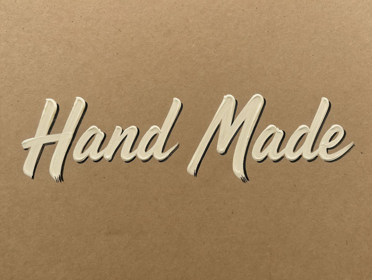
A sign painter's lettering sample on a sheet of kraft paper. The words "Hand Made" painted in a bold, slanted brush script in glossy cream enamel with a thin hand-drawn black drop shadow, slightly uneven strokes and visible brush texture at the ends of each letter. Flat overhead photo, even soft light, nothing else on the paper.

The sample carries the letterforms and the prompt carries the words. The sample says "Hand Made" and the board says "Fresh Today", so the model has to transfer the style to letters the sample never showed. The prompt names what to take, the lettering style, the color and the drop shadow, and leaves the menu lines in plain chalk print so the two styles stay apart.
Tips
-
Quote every line. Double quotes mark the words as copy to set exactly. Unquoted words get paraphrased.
-
Give each line a place, a size and a weight. That trio is the hierarchy of the layout.
-
End with "every line spelled exactly as written, no other text". It holds the spelling and keeps invented copy off the image.
-
Render dense layouts at 4K. The smallest line on a spec sheet needs the pixels to stay sharp after compression.
-
Keep the layout fixed and swap the strings to localize. One description paragraph, seven sets of quoted lines.
-
Name a library font to set the style of a line. Pick one the scene would not reach on its own, and expect the letterforms to vary between runs.
-
Use a lettering sample when the typeface has to match. Say which lines take it and leave the rest in a plain style.
-
Proofread before you publish. A render can still swap or add a letter in a single word, and sending the same request again is the fix.