Recraft V4 Styles

Recraft V4 Styles is the standard raster model in Recraft's V4 Styles family for reference-driven style consistency. It lets teams create a reusable visual style from reference images and then generate new assets that stay close not only to the broad aesthetic direction, but also to finer details such as texture, composition, and rendering character. It is designed for workflows that need immediate style reuse without fine-tuning or LoRA setup, making it a strong fit for branded content, editorial systems, product campaigns, and any image pipeline where a repeatable visual language matters more than one-off prompt creativity.
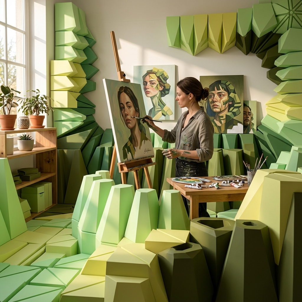
Precise vs flexible style match
How to pick between Recraft V4 Styles match modes: precise for strict style adherence, flexible for a looser vibe, with side-by-side comparisons.
Introduction
settings.styleMatch controls how tightly the model follows the reference style. Two values exist. Precise (the default) follows the reference style meticulously, preserving line quality, palette, texture, and rendering character down to the finer details. Flexible matches the general look of the style but leaves the model more room to interpret the subject and composition, closer to the experience of Recraft V3 Styles refined for V4.
The hero below was generated in precise mode from the four moody chiaroscuro product photographs under it. The subject is a wristwatch the references never showed, but the single warm directional light, the deep shadow behind the object, and the chocolate-to-black background all held tightly.

A vintage brass mechanical wristwatch lying face-up on a dark walnut surface, single warm directional light from the upper left creating a bright specular highlight on the domed crystal and casting a deep shadow behind the watch, dark chocolate background falling to black at the edges, shallow depth of field with the crown in sharp focus, cinematic still-life product photography.
- Leather wallet
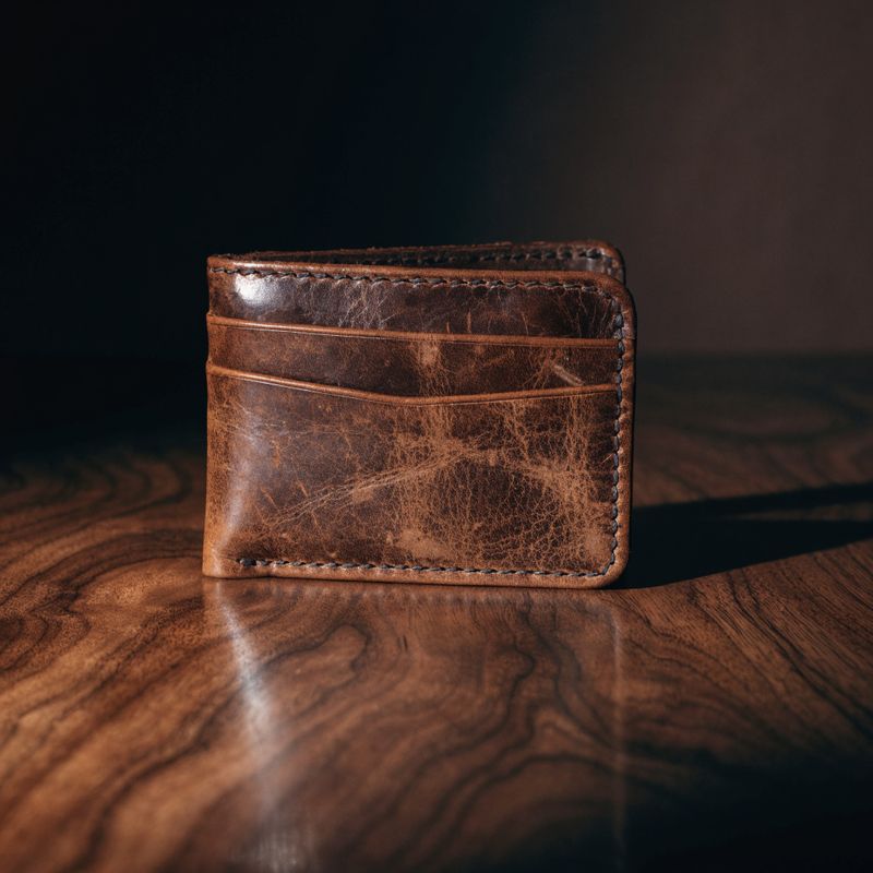
Dramatic chiaroscuro still-life product photography of a worn brown leather bifold wallet on a dark walnut surface, single warm directional light from the upper left creating a bright specular highlight on the wallet and casting a deep shadow behind, dark chocolate background falling to black at the edges.
- Ceramic mug
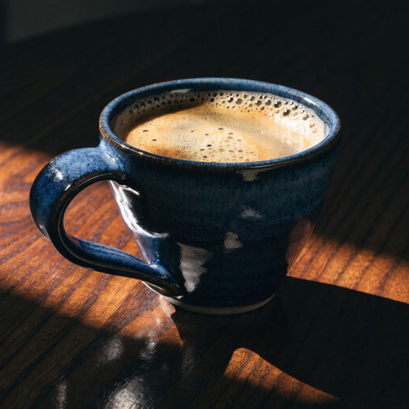
Dramatic chiaroscuro still-life product photography of a hand-thrown ceramic coffee mug in matte navy glaze on a dark walnut surface, single warm directional light from the upper left creating a bright specular highlight on the mug and casting a deep shadow behind, dark chocolate background falling to black at the edges.
- Leather boots
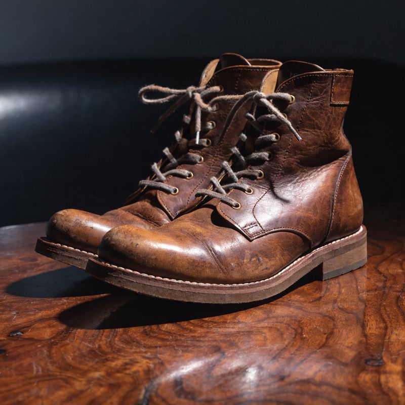
Dramatic chiaroscuro still-life product photography of a pair of well-worn brown leather ankle boots on a dark walnut surface, single warm directional light from the upper left creating a bright specular highlight on the boots and casting a deep shadow behind, dark chocolate background falling to black at the edges.
- Brass compass

Dramatic chiaroscuro still-life product photography of a brass pocket compass with the lid open on a dark walnut surface, single warm directional light from the upper left creating a bright specular highlight on the brass and casting a deep shadow behind, dark chocolate background falling to black at the edges.


Precise is the right default for most work. This guide covers when the flexible mode is the better call, and shows the two modes head-to-head on the same references and prompts so the visual difference is legible.
The two modes
Pass settings.styleMatch on any V4 Styles call to override the default. The setting applies to the current call only. If you attach references and generate a styleId on a call, the mode used on that call is stored as the style's default, and later calls without a settings.styleMatch value inherit it. Setting the value explicitly on a later call overrides the stored default for that request.
import { createClient } from '@runware/sdk'

const client = await createClient({ apiKey: process.env.RUNWARE_API_KEY })
await client.connect()

const [result] = await client.run({
  model: 'recraft:v4@styles',
  positivePrompt: '...',
  inputs: {
    styleId: '5b9e7c8a-1234-4b8f-9c5d-8f7e6a5b4c3d'
  },
  settings: {
    styleMatch: 'flexible'
  },
  width: 1024,
  height: 1024
})
import asyncio
import os
from runware import Runware
async def main():
async with Runware(api_key=os.environ["RUNWARE_API_KEY"]) as client:
results = await client.run({
"model": "recraft:v4@styles",
"positivePrompt": "...",
"inputs": {
"styleId": "5b9e7c8a-1234-4b8f-9c5d-8f7e6a5b4c3d"
},
"settings": {
"styleMatch": "flexible"
},
"width": 1024,
"height": 1024
})
asyncio.run(main())curl https://api.runware.ai/v1 \
-H "Authorization: Bearer $RUNWARE_API_KEY" \
-H "Content-Type: application/json" \
-d '[
{
  "taskType": "imageInference",
  "taskUUID": "c4d5e6f7-a8b9-0c1d-2e3f-4a5b6c7d8e9f",
  "model": "recraft:v4@styles",
  "positivePrompt": "...",
  "inputs": {
    "styleId": "5b9e7c8a-1234-4b8f-9c5d-8f7e6a5b4c3d"
  },
  "settings": {
    "styleMatch": "flexible"
  },
  "width": 1024,
  "height": 1024
}
]'runware run recraft:v4@styles \
positivePrompt=... \
inputs.styleId=5b9e7c8a-1234-4b8f-9c5d-8f7e6a5b4c3d \
settings.styleMatch=flexible \
width=1024 \
height=1024{
"taskType": "imageInference",
"taskUUID": "c4d5e6f7-a8b9-0c1d-2e3f-4a5b6c7d8e9f",
"model": "recraft:v4@styles",
"positivePrompt": "...",
"inputs": {
"styleId": "5b9e7c8a-1234-4b8f-9c5d-8f7e6a5b4c3d"
},
"settings": {
"styleMatch": "flexible"
},
"width": 1024,
"height": 1024
}Precise mode is the reason V4 Styles exists as a separate model rather than a setting on the standard V4 image models. In a blind, third-party-judged benchmark across 159 real-world styles, precise won 91.6 percent of head-to-head matchups against seven leading models. Flexible loosens that adherence intentionally, for the cases where creative range matters more than exact reproduction.
Direct comparison
The two outputs below use the same five riso print references and the same prompt. The only variable is settings.styleMatch.

A stylized figure of a solo dancer mid-leap with arms extended overhead, silhouetted against a bold gradient sky, the words "NORTH LOOP 2026" in a heavy block sans-serif at the top of the frame, riso print poster composition with layered fluorescent inks and grainy paper texture.

A stylized figure of a solo dancer mid-leap with arms extended overhead, silhouetted against a bold gradient sky, the words "NORTH LOOP 2026" in a heavy block sans-serif at the top of the frame, riso print poster composition with layered fluorescent inks and grainy paper texture.
The precise output holds the reference character down to the specific ink layering (misregistered fluorescent pink over blue), the halftone grain, and the paper texture beneath the print. The flexible output keeps the broad palette and the poster feel, but drops some of the ink-registration noise and cleans up the grain. Both are usable. The choice depends on whether the deliverable is meant to look like a genuine riso print (precise) or a poster inspired by that aesthetic (flexible).
A second comparison, same style references, different subject:

A stylized mountain landscape at dawn for a book cover, layered peaks receding into the distance, a lone hiker silhouette in the foreground, a bold horizontal gradient sky from deep purple to warm coral, riso print composition with layered fluorescent inks and grainy paper texture.

A stylized mountain landscape at dawn for a book cover, layered peaks receding into the distance, a lone hiker silhouette in the foreground, a bold horizontal gradient sky from deep purple to warm coral, riso print composition with layered fluorescent inks and grainy paper texture.
Same pattern: precise stays inside the riso print world with the specific ink texture and grain, flexible interprets the reference more loosely and produces something adjacent to the source style. On a subject where the reference character is the entire selling point (a genuine screenprint feel, a specific illustrator's rendering, a brand asset that must match past work), precise is the right call. On a subject where the reference is a mood anchor rather than an exact target, flexible produces cleaner, more varied output.
The reference set used for both comparisons is below.

A riso print poster illustration of a stylized city skyline at dusk, layered fluorescent pink and cobalt blue inks with visible misregistration, grainy paper texture, high-contrast composition.

A riso print poster illustration of a stylized portrait of a woman with wind-blown hair, layered fluorescent pink and mustard yellow inks with visible misregistration, grainy paper texture.

A riso print poster illustration of a stylized cat sitting upright with tail curled around its paws, layered fluorescent blue and orange inks with visible misregistration, grainy paper texture.

A riso print poster illustration of a stylized electric guitar viewed from above on a plain background, layered fluorescent pink and cobalt blue inks with visible misregistration, grainy paper texture.

A riso print poster illustration of a stylized single large tree with a full round canopy on a plain background, layered fluorescent yellow and cobalt blue inks with visible misregistration, grainy paper texture.
When to reach for each
Precise is the default because most style-consistent workflows want the reference character preserved.
Reach for precise when:
- The deliverable has to match past work (brand assets that need to look identical to an existing library, a series that must feel like one hand made it)
- The reference style itself is the selling point (a genuine screenprint, a specific illustrator's ink line, a distinctive photographic lighting signature)
- The output goes to a client who chose the reference style deliberately
- Small deviations in texture or palette would be noticed
Reach for flexible when:
- The reference is a mood anchor rather than an exact target (loose inspiration for a family of images, atmospheric direction for a campaign)
- The subject is far enough from the reference subjects that a meticulous match would look forced
- The output is exploratory or a starting point for further art direction
- Variety across generations matters more than a tight lock
A workflow that starts flexible and moves to precise once the style direction is nailed down works well. Explore in flexible, ship in precise.
Tips
-
Precise is the default. Set flexible explicitly when you want it. Omitting
settings.styleMatchgives you precise. Only add the setting when you want the looser match. -
The mode set on a style-creation call becomes the default for that style. Later calls with the same
styleIdinherit the mode unless they setsettings.styleMatchexplicitly. Setting it on any call overrides for that request only. -
Precise handles complex styles better than flexible. Textured print aesthetics, distinctive line work, photographic lighting signatures all preserve more cleanly under precise. Flexible drops the specifics.
-
Flexible reads more like V3 Styles. Teams migrating from V3 who want the same feel can set
flexibleto keep the looser interpretation, then switch to precise where they need a tighter match. -
Explore in flexible, ship in precise. Early style exploration benefits from flexible's wider range. Once the direction is locked and you're building the deliverable set, precise gives the tight adherence that keeps the series coherent.