Krea 2 Medium

Krea 2 Medium is the smaller, faster, and more cost-efficient variant in the Krea 2 family. It applies heavier post-training for especially stable and consistent outputs, making it a strong fit for illustration, anime, painting, graphic design, and other expressive visual workflows. It supports text-to-image and image-to-image generation, prompt interpretation strength through the creativity control, and up to 10 weighted reference images with both positive and negative guidance.
Creativity control and style transfer
How to steer Krea 2 with the creativity parameter, weighted style reference images, and moodboards. Together these cover faithful renders through bold reinterpretation.
Introduction
Krea 2 is built for aesthetic control. It supports a wide range of visual styles and gives you three tools to steer the output: settings.creativity, which controls how far the model goes beyond your prompt, inputs.referenceImages for inline style references, and settings.moodboards for curated style directions built from groups of images.

A woman in a flowing crimson silk dress walks through an ancient olive grove at golden hour, dappled light filtering through silver-green leaves, warm amber tones, cinematic shallow depth of field, fine art photography
This guide covers all three: how the four creativity levels transform output character, how inline style references and their strength values work, how moodboards provide a higher-level style direction, and how these tools interact when combined.
Creativity levels
The settings.creativity parameter controls how literally the model follows your prompt. At one end, the model renders exactly what you described and nothing more. At the other, it treats the prompt as a starting point and adds its own interpretation of style, composition, color, and mood.
The parameter takes four values: raw, low, medium (the default), and high.
All four images below use the same short prompt: "An automotive photograph of a black sports car on a wet asphalt road." The prompt is deliberately minimal so the creativity parameter does most of the visual work.

An automotive photograph of a black sports car on a wet asphalt road

An automotive photograph of a black sports car on a wet asphalt road

An automotive photograph of a black sports car on a wet asphalt road

An automotive photograph of a black sports car on a wet asphalt road
At raw, the model performs no prompt expansion. It renders the subject with no added lighting direction or atmosphere beyond what's strictly needed. At low, the model adds minor polish, maybe a slightly more considered angle or softer shadows. At medium, the default, the model starts making real aesthetic decisions: adding warm color temperature, depth of field, and background context. At high, the model takes full creative liberty and can produce outputs that feel cinematic, adding dramatic moody lighting, environmental reflections, and rich narrative atmosphere well beyond what the text described.
The effect becomes more pronounced with descriptive prompts. When you give the model more visual information to work with, the creativity parameter controls how much the model embellishes beyond what you explicitly asked for.


At raw, the model delivers the boat and sand you described. At high, it adds atmospheric depth and may shift the color palette toward a broader artistic sensibility. Same prompt, different creative latitude.
The API request sets it through settings.creativity:
import { createClient } from '@runware/sdk'

const client = await createClient({ apiKey: process.env.RUNWARE_API_KEY })
await client.connect()

const [result] = await client.run({
  model: 'krea:krea@2-medium',
  positivePrompt: 'An automotive photograph of a black sports car on a wet asphalt road',
  width: 1024,
  height: 1024,
  settings: {
    creativity: 'high'
  }
})
import asyncio
import os
from runware import Runware
async def main():
async with Runware(api_key=os.environ["RUNWARE_API_KEY"]) as client:
results = await client.run({
"model": "krea:krea@2-medium",
"positivePrompt": "An automotive photograph of a black sports car on a wet asphalt road",
"width": 1024,
"height": 1024,
"settings": {
"creativity": "high"
}
})
asyncio.run(main())curl https://api.runware.ai/v1 \
-H "Authorization: Bearer $RUNWARE_API_KEY" \
-H "Content-Type: application/json" \
-d '[
{
  "taskType": "imageInference",
  "taskUUID": "a1b2c3d4-e5f6-7890-abcd-ef1234567890",
  "model": "krea:krea@2-medium",
  "positivePrompt": "An automotive photograph of a black sports car on a wet asphalt road",
  "width": 1024,
  "height": 1024,
  "settings": {
    "creativity": "high"
  }
}
]'runware run krea:krea@2-medium \
positivePrompt="An automotive photograph of a black sports car on a wet asphalt road" \
width=1024 \
height=1024 \
settings.creativity=high{
"taskType": "imageInference",
"taskUUID": "a1b2c3d4-e5f6-7890-abcd-ef1234567890",
"model": "krea:krea@2-medium",
"positivePrompt": "An automotive photograph of a black sports car on a wet asphalt road",
"width": 1024,
"height": 1024,
"settings": {
"creativity": "high"
}
}Response
{
  "data": [
    {
      "taskType": "imageInference",
      "taskUUID": "a1b2c3d4-e5f6-7890-abcd-ef1234567890",
      "imageUUID": "f1e2d3c4-b5a6-7890-1234-567890abcdef",
      "imageURL": "https://im.runware.ai/image/os/a14d18/ws/2/ii/f1e2d3c4-b5a6-7890-1234-567890abcdef.jpg"
    }
  ]
}
When to use each level
raw is for strict prompt adherence. Use it when the output should contain exactly what's described and nothing else: technical product renderings, UI mockups, assets that will be composited into a larger design where artistic additions would interfere.
low stays close to the prompt but gives the model room for minor polish. Good for product photography and architectural renders, or any scenario where you want a clean, professional result without surprises.
medium is the default and the right starting point for most prompts. The model adds visual depth and makes choices about lighting, color, and composition that improve the output without straying from the subject. If you're not sure which level to pick, leave it here.
high is for exploration. The model interprets short prompts broadly and adds stylistic choices you didn't ask for. It is the best setting for creative brainstorming and any workflow where you want the model to contribute ideas rather than just execute instructions.
Style transfer with reference images
The inputs.referenceImages array lets you pass up to 10 images that guide the visual style of the output. Krea 2 extracts the palette, texture, brushwork, composition patterns, and overall aesthetic from the references and applies them to whatever the prompt describes.
Each reference can be a plain image input (URL, base64, data URI, or UUID) or an object with an image and a per-image strength value. The strength defaults to 0.5 and ranges from 0 to 1.
Below is the same prompt rendered without and with a retrowave style reference.


- Style reference
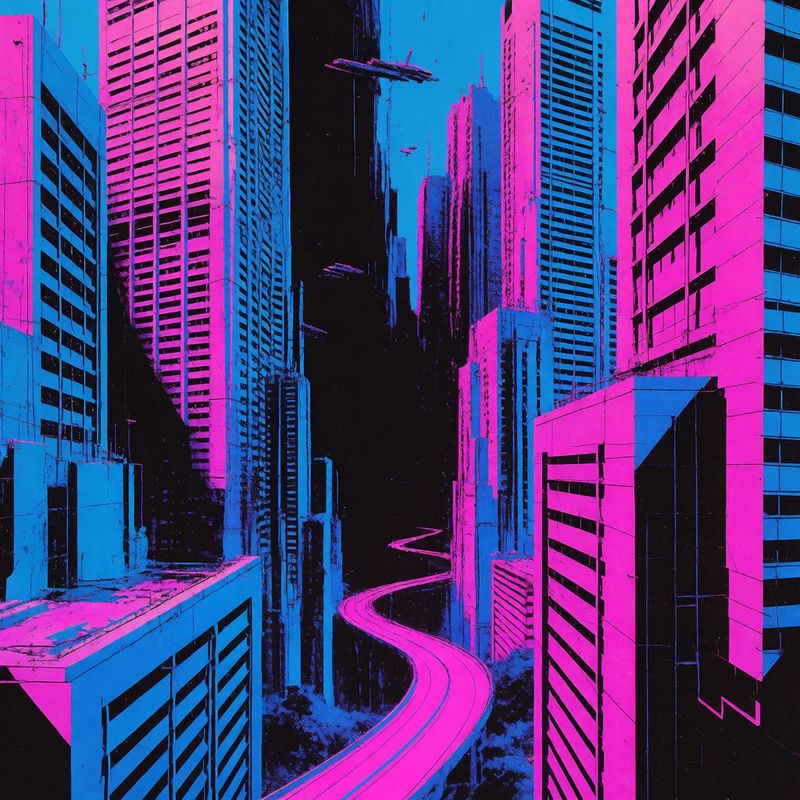

The prompt is identical in both generated images. The reference image carries the entire style change: the output picks up the glowing neon pinks and cyans, the stark grid geometry, and the VHS aesthetic without any of those details appearing in the prompt text.
The API request includes the reference under inputs.referenceImages:
[
  {
    "taskType": "imageInference",
    "taskUUID": "b2c3d4e5-f6a7-8901-bcde-f23456789012",
    "model": "krea:krea@2-medium",
    "positivePrompt": "A folded paper origami crane sitting on a minimalist dark surface, clean geometric lines, soft studio lighting",
    "width": 1184,
    "height": 896,
    "settings": {
      "creativity": "medium"
    },
    "inputs": {
      "referenceImages": [
        {
          "image": "https://example.com/retrowave-reference.jpg",
          "strength": 0.5
        }
      ]
    }
  }
]
Tuning reference strength
The strength value on each reference image controls how strongly that reference shapes the output. The range spans from 0 to 1, and each region produces a qualitatively different effect.

A folded paper origami crane sitting on a minimalist dark surface, clean geometric lines, soft studio lighting

A folded paper origami crane sitting on a minimalist dark surface, clean geometric lines, soft studio lighting
A folded paper origami crane sitting on a minimalist dark surface, clean geometric lines, soft studio lighting

A folded paper origami crane sitting on a minimalist dark surface, clean geometric lines, soft studio lighting

A folded paper origami crane sitting on a minimalist dark surface, clean geometric lines, soft studio lighting
Low values (0 to 0.3) act as a light suggestion. You'll see hints of the reference palette and texture, but the model's own rendering style dominates.
Default range (0.4 to 0.6) produces a clear style transfer. The output reads as the same medium as the reference while still following the prompt content.
High values (0.7 to 0.9) lock the output tightly to the reference aesthetic. The reference's palette and texture take priority, sometimes at the cost of prompt fidelity. Details in the prompt may be simplified or reinterpreted to fit the style.
Maximum (1.0) pushes the output to near-replication of the reference's visual language. The prompt provides subject matter, but almost everything else comes from the reference. Useful when you need output that could pass as part of the same series as the reference.
Start with the default strength of 0.5 and adjust from there. The sweet spot for most workflows is 0.3 to 0.7. Below 0.2, the reference effect may not be noticeable. Above 0.8, prompt adherence drops significantly.
Moodboards
Moodboards provide a different approach to style transfer. Instead of passing individual reference images per request, a moodboard is a pre-built collection of images that share an overall creative direction. You create one in Krea's moodboard editor, and reference it by ID when running inference.
The difference from inline references: reference images give you per-image control (each with its own strength). Moodboards encode a broader aesthetic from multiple images at once, distilled into a single direction the model follows. They're faster to use in production because you set up the style once and then reuse the ID across any number of requests.
Krea 2 ships with a set of built-in moodboards:
| Moodboard | ID |
|---|---|
| Retro Web | 36faac0b-2b82-45b7-961f-5019cfc886c0 |
| Futurist Glam | 0bff265b-ba63-468f-9acb-e38705a343b8 |
| Coquette | 99f3fd48-c434-4f50-a798-57d3a0e3c064 |
| Cyber Zine | 1b1aaa13-b4dd-4db8-b550-0305324dd70b |
| Lo-Fi Cyanotype | 1c173dd2-e6b3-47f6-9565-93485cec15be |
| Impasto Expressionism | 29499086-a16b-4ee9-b04a-fdabea7e050b |
| Expressive Marker | cb3a3e97-7eb6-4ed8-adee-18e384310f7c |
| Thermal Airbrush | c3421c04-db95-4f18-a229-003227a54669 |
| Minimalist Sketch | 4372ab77-fd8c-4c86-9c88-03b6f0d91ee3 |
| Film Noir | 3b1ec8e1-3eda-467d-be5d-4fa5eda3b70c |
| Vintage Pop Graphic | d4d96c37-a989-457a-94ee-6a0a968d178c |

A woman with wavy auburn hair sitting by a tall window in a quiet café, golden afternoon light falling across her face, a steaming cup of coffee on the marble table, soft reflections on the glass

A woman with wavy auburn hair sitting by a tall window in a quiet café, golden afternoon light falling across her face, a steaming cup of coffee on the marble table, soft reflections on the glass

A woman with wavy auburn hair sitting by a tall window in a quiet café, golden afternoon light falling across her face, a steaming cup of coffee on the marble table, soft reflections on the glass

A woman with wavy auburn hair sitting by a tall window in a quiet café, golden afternoon light falling across her face, a steaming cup of coffee on the marble table, soft reflections on the glass

A woman with wavy auburn hair sitting by a tall window in a quiet café, golden afternoon light falling across her face, a steaming cup of coffee on the marble table, soft reflections on the glass

A woman with wavy auburn hair sitting by a tall window in a quiet café, golden afternoon light falling across her face, a steaming cup of coffee on the marble table, soft reflections on the glass

A woman with wavy auburn hair sitting by a tall window in a quiet café, golden afternoon light falling across her face, a steaming cup of coffee on the marble table, soft reflections on the glass

A woman with wavy auburn hair sitting by a tall window in a quiet café, golden afternoon light falling across her face, a steaming cup of coffee on the marble table, soft reflections on the glass

A woman with wavy auburn hair sitting by a tall window in a quiet café, golden afternoon light falling across her face, a steaming cup of coffee on the marble table, soft reflections on the glass

A woman with wavy auburn hair sitting by a tall window in a quiet café, golden afternoon light falling across her face, a steaming cup of coffee on the marble table, soft reflections on the glass

A woman with wavy auburn hair sitting by a tall window in a quiet café, golden afternoon light falling across her face, a steaming cup of coffee on the marble table, soft reflections on the glass

A woman with wavy auburn hair sitting by a tall window in a quiet café, golden afternoon light falling across her face, a steaming cup of coffee on the marble table, soft reflections on the glass
The prompt is identical across all twelve. The moodboard carries the entire visual transformation: palette, lighting treatment, texture, and compositional emphasis.
The API request sets it through settings.moodboards:
import { createClient } from '@runware/sdk'

const client = await createClient({ apiKey: process.env.RUNWARE_API_KEY })
await client.connect()

const [result] = await client.run({
  model: 'krea:krea@2-medium',
  positivePrompt: 'A woman with wavy auburn hair sitting by a tall window in a quiet café, golden afternoon light falling across her face, a steaming cup of coffee on the marble table, soft reflections on the glass',
  width: 1024,
  height: 1024,
  settings: {
    creativity: 'medium',
    moodboards: [
      {
        id: '0bff265b-ba63-468f-9acb-e38705a343b8'
      }
    ]
  }
})
import asyncio
import os
from runware import Runware
async def main():
async with Runware(api_key=os.environ["RUNWARE_API_KEY"]) as client:
results = await client.run({
"model": "krea:krea@2-medium",
"positivePrompt": "A woman with wavy auburn hair sitting by a tall window in a quiet café, golden afternoon light falling across her face, a steaming cup of coffee on the marble table, soft reflections on the glass",
"width": 1024,
"height": 1024,
"settings": {
"creativity": "medium",
"moodboards": [
{
"id": "0bff265b-ba63-468f-9acb-e38705a343b8"
}
]
}
})
asyncio.run(main())curl https://api.runware.ai/v1 \
-H "Authorization: Bearer $RUNWARE_API_KEY" \
-H "Content-Type: application/json" \
-d '[
{
  "taskType": "imageInference",
  "taskUUID": "c3d4e5f6-a7b8-9012-cdef-345678901234",
  "model": "krea:krea@2-medium",
  "positivePrompt": "A woman with wavy auburn hair sitting by a tall window in a quiet café, golden afternoon light falling across her face, a steaming cup of coffee on the marble table, soft reflections on the glass",
  "width": 1024,
  "height": 1024,
  "settings": {
    "creativity": "medium",
    "moodboards": [
      {
        "id": "0bff265b-ba63-468f-9acb-e38705a343b8"
      }
    ]
  }
}
]'runware run krea:krea@2-medium \
positivePrompt="A woman with wavy auburn hair sitting by a tall window in a quiet café, golden afternoon light falling across her face, a steaming cup of coffee on the marble table, soft reflections on the glass" \
width=1024 \
height=1024 \
settings.creativity=medium \
settings.moodboards.0.id=0bff265b-ba63-468f-9acb-e38705a343b8{
"taskType": "imageInference",
"taskUUID": "c3d4e5f6-a7b8-9012-cdef-345678901234",
"model": "krea:krea@2-medium",
"positivePrompt": "A woman with wavy auburn hair sitting by a tall window in a quiet café, golden afternoon light falling across her face, a steaming cup of coffee on the marble table, soft reflections on the glass",
"width": 1024,
"height": 1024,
"settings": {
"creativity": "medium",
"moodboards": [
{
"id": "0bff265b-ba63-468f-9acb-e38705a343b8"
}
]
}
}Response
{
  "data": [
    {
      "taskType": "imageInference",
      "taskUUID": "c3d4e5f6-a7b8-9012-cdef-345678901234",
      "imageUUID": "d4e5f6a7-b8c9-0123-4567-890abcdef123",
      "imageURL": "https://im.runware.ai/image/os/a14d18/ws/2/ii/d4e5f6a7-b8c9-0123-4567-890abcdef123.jpg"
    }
  ]
}
Tuning moodboard strength
Each moodboard entry accepts an optional strength value that controls how strongly the moodboard shapes the output. The range is 0 to 1, with a default of 0.23.

A woman with wavy auburn hair sitting by a tall window in a quiet café, golden afternoon light falling across her face, a steaming cup of coffee on the marble table, soft reflections on the glass

A woman with wavy auburn hair sitting by a tall window in a quiet café, golden afternoon light falling across her face, a steaming cup of coffee on the marble table, soft reflections on the glass

A woman with wavy auburn hair sitting by a tall window in a quiet café, golden afternoon light falling across her face, a steaming cup of coffee on the marble table, soft reflections on the glass

A woman with wavy auburn hair sitting by a tall window in a quiet café, golden afternoon light falling across her face, a steaming cup of coffee on the marble table, soft reflections on the glass

A woman with wavy auburn hair sitting by a tall window in a quiet café, golden afternoon light falling across her face, a steaming cup of coffee on the marble table, soft reflections on the glass

A woman with wavy auburn hair sitting by a tall window in a quiet café, golden afternoon light falling across her face, a steaming cup of coffee on the marble table, soft reflections on the glass
At 0, the moodboard effect is barely perceptible. You may notice a faint shift in warmth or texture, but the output reads as a near-standard generation. At 0.1, the style hint becomes slightly clearer but still subtle. At the default 0.23, the moodboard applies a clear but balanced style shift. At 0.5, the style is prominent and the model starts adapting surfaces and lighting to match the moodboard direction. At 0.8, the style dominates and the model reinterprets the scene through the moodboard's visual language. At 1.0, the moodboard overrides nearly everything: the subject may become secondary to the style.
Moodboard strength and reference image strength serve the same purpose and share the same range. Reference images default to 0.5 and moodboards default to 0.23, both on a 0 to 1 scale. The lower moodboard default reflects that moodboards encode a more concentrated style signal from multiple source images.
Combining creativity with references
Creativity and style references interact. The creativity parameter controls how freely the model interprets the prompt, while the reference controls the visual language the model works in. Changing one shifts the output character in a predictable way.

An automotive photograph of a black sports car on a wet asphalt road

An automotive photograph of a black sports car on a wet asphalt road
Both images use the same short prompt and the same style reference at strength 0.15. The difference is purely in how the model interprets the prompt. With raw creativity, the scene follows the description literally: a car, wet asphalt, with a faint neon retrowave wash. With high creativity, the model takes compositional liberty and may add atmospheric lighting or introduce environmental context that goes well beyond the prompt text.
Reference images carry a strong signal. Even at moderate strength values (0.3 to 0.5), a reference can dominate the output enough to flatten creativity differences. If you're combining references with different creativity levels and the results look too similar, lower the reference strength. In this example, strength had to drop to 0.15 before the creativity parameter had enough room to produce a visible difference.
For production workflows where consistency matters, pair references with low or medium creativity. For exploration, crank creativity to high and let the model surprise you.
Medium vs. Large
Both Krea 2 Medium and Large share the same parameters and feature set. The differences are in model capacity and post-training character.


Krea 2 Medium applies heavier post-training, which makes its outputs more stable and consistent across generations. It handles illustration, anime, painting, and graphic design styles reliably. It's faster and cheaper, and the recommended starting point for most use cases.
Krea 2 Large is more than twice the size of Medium, with lighter post-training that gives outputs a rawer, more textured character. Large produces higher-ceiling results on photorealism and on visual styles that benefit from imperfection: film grain, motion blur, low dynamic range, and other looks that heavier post-training tends to smooth away.
Pick Medium when you need consistent, predictable output across batch runs. Pick Large when you want the model to push further on a single image and you're willing to re-roll for the best result.
Aesthetic range
Krea 2 renders a wide spectrum of visual styles without defaulting to a single polished look. The following images were all generated with Krea 2 Medium, each with a different prompt and creativity level.

Terraced rice paddies cascading down a misty mountainside at sunrise, emerald green fields reflecting soft golden light, a small wooden hut at the edge, landscape photography

A whimsical children's book illustration of a fox reading a book under a tree full of glowing lanterns, ink and watercolor on textured paper, warm autumn palette

An abstract mixed-media collage of geometric shapes, torn paper textures, ink splatters, and metallic gold leaf on a deep navy background, contemporary art

A neon-lit ramen shop on a narrow Tokyo back alley at night, steam rising from bowls, warm lantern glow against blue shadows, cinematic street photography

A close-up portrait of an elderly jazz musician playing a trumpet under a single blue spotlight, film grain, shallow depth of field, moody low-key lighting

A brutalist concrete building photographed from below against a pale overcast sky, strong geometric shadows, muted desaturated tones, architectural photography
From landscape photography to children's book illustration, abstract collage to moody jazz portraiture and urban night scenes. The model doesn't flatten these into a uniform rendering style. Each output reads as if it was produced with a different medium, because the model understands aesthetics as a first-class concept rather than a fixed output filter.
Tips
-
Start with
mediumcreativity. It's the default for a reason. It adds enough visual depth to make outputs feel polished without straying from the prompt. Only move tohighwhen you want the model to contribute its own ideas, and only torawwhen strict adherence matters. -
Use short prompts with high creativity. The model fills in what you leave out. A five-word prompt at
highcreativity produces more interesting variety than a fifty-word prompt atraw, because the model has room to interpret. For brainstorming and exploration, write less and let the parameter do the work. -
Match reference strength to your intent. Default
0.5is a good balance. Push above0.8when you want the output to look like it was made by the same artist as the reference. Drop below0.3when you want just a hint of the style. -
Keep reference count low for consistency. One strong reference produces more predictable results than five weak ones. Multiple references can conflict if their styles diverge, and the model resolves conflicts unpredictably. If you need to combine influences, start with two references and check the output before adding more.
-
Use moodboards for repeatable style direction. If you find yourself passing the same reference images across multiple requests, consider creating a moodboard with those images in Krea. You get the same style transfer with a single ID instead of uploading references every time.
-
Use
seedfor controlled comparisons. When comparing creativity levels or reference strengths, set a fixedseedto isolate the variable you're testing. Without a fixed seed, compositional differences between runs make it harder to see the effect of the parameter you changed. -
Try Large for photorealism. Medium is the safer default, but Large produces noticeably stronger photorealistic output. If you're generating camera-realistic imagery and the extra cost and latency are acceptable, Large is worth testing.