Recraft V4 Styles Vector
Request
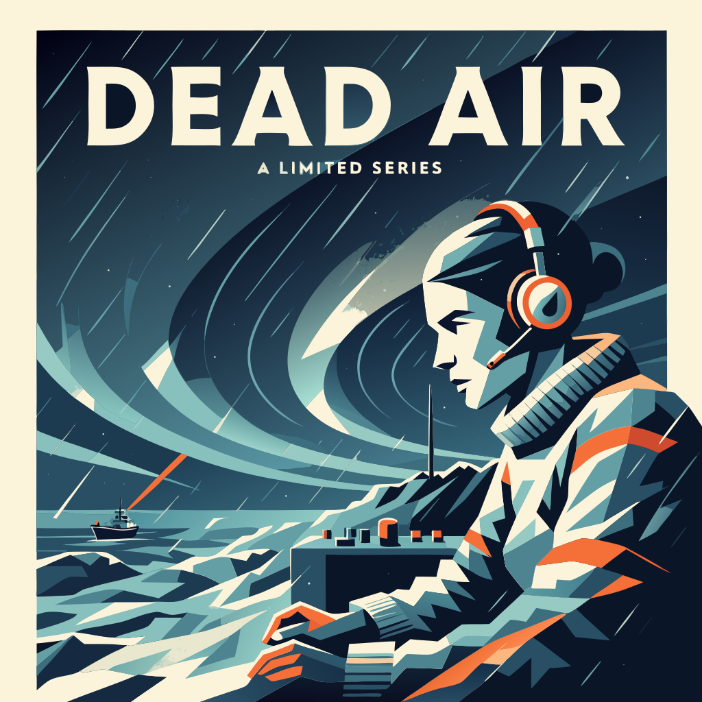
Create finished square streaming-series key art in the shared visual language of the three reference images: clean scalable vector artwork, geometric modernist screen-print construction, crisp flat shapes, dramatic diagonals, economical detail and subtle vector halftone accents. New subject: a tense historical drama set at a remote Arctic radio station in 1931. Center a determined female distress-radio operator in three-quarter profile wearing a heavy wool sweater and period headset, listening intently at a compact Morse radio desk. Shape her face and clothing with bold graphic planes rather than realism. Behind her, transform concentric radio waves into sweeping aurora ribbons across a polar night sky. At the lower edge, include a tiny icebound research ship sending one signal pulse toward the station, with angular snowdrifts and a narrow antenna mast establishing the isolated setting. Use midnight navy as the dominant field with glacier cyan, warm cream and sharply limited signal-orange accents. High contrast, ominous and intelligent mood, clear silhouette, strong focal hierarchy, generous negative space, no photographic effects and no 3D rendering. Integrate the exact title “DEAD AIR” in large condensed uppercase lettering across the upper third, with “A LIMITED SERIES” in small uppercase lettering beneath it. Typography should feel custom, severe and period-informed while remaining highly legible. No other copy, logos, platform branding, credit block, border, mockup or interface.
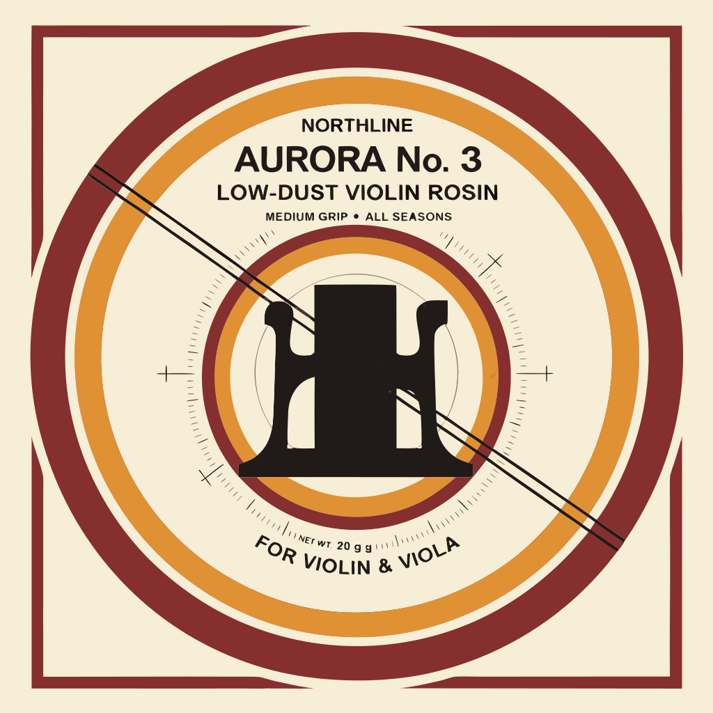
Create a finished, print-ready circular lid label for premium violin rosin, presented as flat standalone vector artwork centered on a 1024x1024 square canvas. Apply the coherent visual language of the three references—Swiss-modernist geometry, precise technical linework, asymmetrical balance, concentric mechanical forms and subtle screen-printed character—but do not copy their objects or wording. The new central subject is an elegant front-facing violin bridge reduced to a strong geometric symbol, framed by a translucent-looking amber rosin-disc motif rendered entirely with layered flat vector shapes. Add two taut diagonal bow-hair lines crossing behind the bridge and tiny radial calibration ticks suggesting controlled friction and tone. Use a warm cream ground with oxblood, amber-gold and near-black inks. Strong circular border system, generous negative space, clean scalable paths, sharp edges, limited spot-color appearance, no gradients and no photorealism. Include clear, intentional packaging typography with this exact hierarchy: “NORTHLINE” at the top, “AURORA No. 3” as the main product name, “LOW-DUST VIOLIN ROSIN” beneath it, and “FOR VIOLIN & VIOLA” along the lower arc. Add small functional copy “MEDIUM GRIP • ALL SEASONS” and “NET WT. 20 g”. Refined specialist music-accessory packaging with a quiet, exacting workshop mood. Show only the finished label artwork: no tin mockup, no tabletop, no hands, no shadows, no dielines, no crop marks and no surrounding scene.
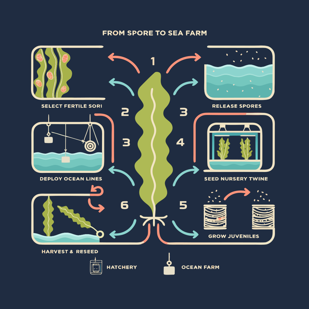
Create a finished square vector infographic for a commercial kelp hatchery training guide titled “FROM SPORE TO SEA FARM.” Use the three reference images only as the visual style system: match their rounded geometric forms, bold consistent outlines, flat color blocks, subtle offset shadows, modular diagram logic, restrained palette, and friendly technical precision. Do not reuse their subject matter. Explain the kelp production cycle as six clearly numbered stages arranged clockwise around one large central kelp frond: 1 SELECT FERTILE SORI — a close-up mature kelp blade with the fertile tissue highlighted; 2 RELEASE SPORES — blade fragments in a cool seawater vessel releasing tiny spores; 3 SEED NURSERY TWINE — spores settling onto twine wrapped around a small spool; 4 GROW JUVENILES — miniature kelp developing on spools inside an illuminated hatchery tank; 5 DEPLOY OCEAN LINES — a workboat attaching seeded twine to a horizontal offshore grow line suspended by buoys; 6 HARVEST & RESEED — long mature kelp lifted from the water, with a small circular return arrow leading back to stage one. Connect every stage with thick, unmistakable clockwise arrows. Use compact spot illustrations with enough biological and equipment detail to be genuinely educational while remaining clean and scalable. Include small visual distinctions between microscopic spores, juvenile blades, and mature kelp. Show the nursery tank and offshore line as simple cutaway diagrams. Keep the hierarchy immediate: title at top, central kelp hero illustration, six evenly spaced process modules, then a small footer key reading “HATCHERY” beside a tank icon and “OCEAN FARM” beside a buoy icon. Typography should be uppercase, highly legible, bold geometric sans serif, with only the exact text specified. Deep navy background with warm cream lines and lettering, sea-glass cyan water, vivid chartreuse kelp, and restrained coral highlights. Crisp SVG-like vector edges, flat fills, no gradients, no photographic effects, no excessive decoration, no branding, no logo, no website or app interface, and no mockup presentation.
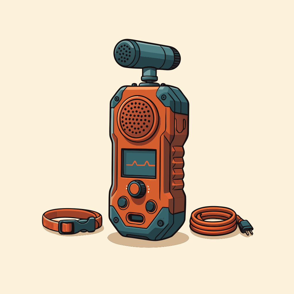
Create a finished clean vector ecommerce packshot of a professional handheld ultrasonic bat detector used by wildlife surveyors. Show one rugged palm-sized detector in a clear three-quarter front view, centered and large within a square composition. The device has a burnt-orange impact-resistant shell, charcoal rubber corner guards, a small dark display with simple nonverbal waveform marks, a circular control dial, two tactile buttons, a perforated ultrasonic microphone grille and a short detachable directional microphone mounted at the top. Arrange a slim wrist lanyard and one coiled field cable neatly beside the main unit as secondary accessories without competing with it. Match the reference images closely: premium neo-utilitarian field-equipment illustration, precise geometric construction, bold controlled dark outlines, flat interlocking vector shapes, restrained highlights, minimal gradients and a subtle offset grounding shadow. Use a petrol blue, burnt orange, charcoal and warm cream palette against an uncluttered warm ivory background. Preserve believable product proportions, seams, fasteners, ports and molded grip details while keeping every shape suitable for scalable SVG artwork. Marketplace-ready isolated product presentation, generous breathing room, no hands, no scenery, no packaging, no logo, no brand name, no readable text, no border and no interface mockup.