Recraft V4 Styles Pro
Request
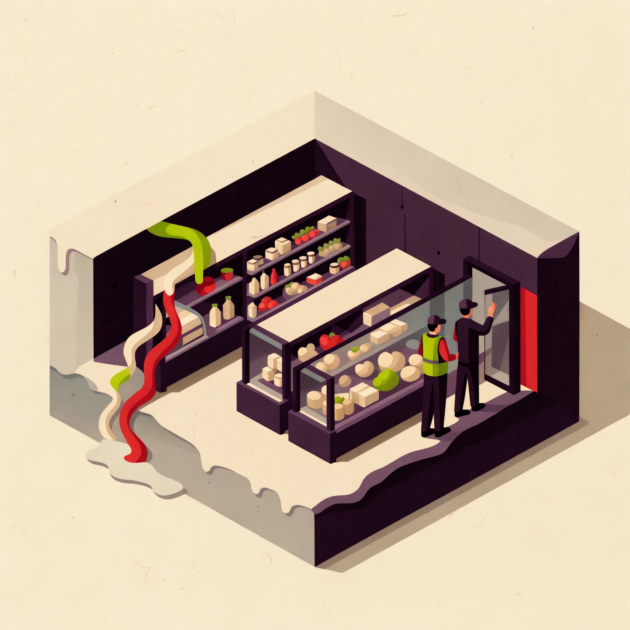
Create an original square advertising campaign visual for a commercial refrigeration retrofit service aimed at independent supermarket owners. Use the three reference images only as a coherent guide to rendering language, texture, palette, shape design, and compositional rhythm; do not reproduce their subjects, layouts, buildings, or objects. The central visual metaphor is a compact neighborhood supermarket presented as a clean isometric cutaway inside a large translucent ice cube. Through the open front, show one recognizable grocery aisle lined with refrigerated display cases. On the left, an old open-front chiller leaks cold air outward as curling vermilion and cream ribbons, causing that side of the ice cube to melt into a small irregular puddle. On the right, newly fitted transparent glass refrigerator doors hold the cold inside; that half of the cube remains sharply faceted, solid, and efficient. Include two small refrigeration technicians in practical work clothes installing the final glass door, giving the scene believable commercial purpose and human scale. Shelves should suggest neatly arranged produce and dairy through simple abstract shapes, without readable labels or branded packaging. Render the image in the shared tactile editorial style of the references: layered cut-paper construction, chunky screenprinted color fields, dry-ink grain, subtle misregistration, visible paper fibers, simplified geometric architecture, selective fine detail, crisp dimensional overlaps, and sophisticated magazine-ad polish. Use primarily inky plum, acid chartreuse, warm cream, and vermilion, with restrained pale icy blue only for the translucent cube and glass. Bold, clever, optimistic, and operational rather than whimsical. Strong central silhouette, immediate visual hierarchy, generous uncluttered warm-cream negative space in the upper-left quadrant for optional campaign copy, but include no words, letters, numbers, logos, badges, borders, interface elements, or watermarks. Finished standalone advertising artwork, square composition.
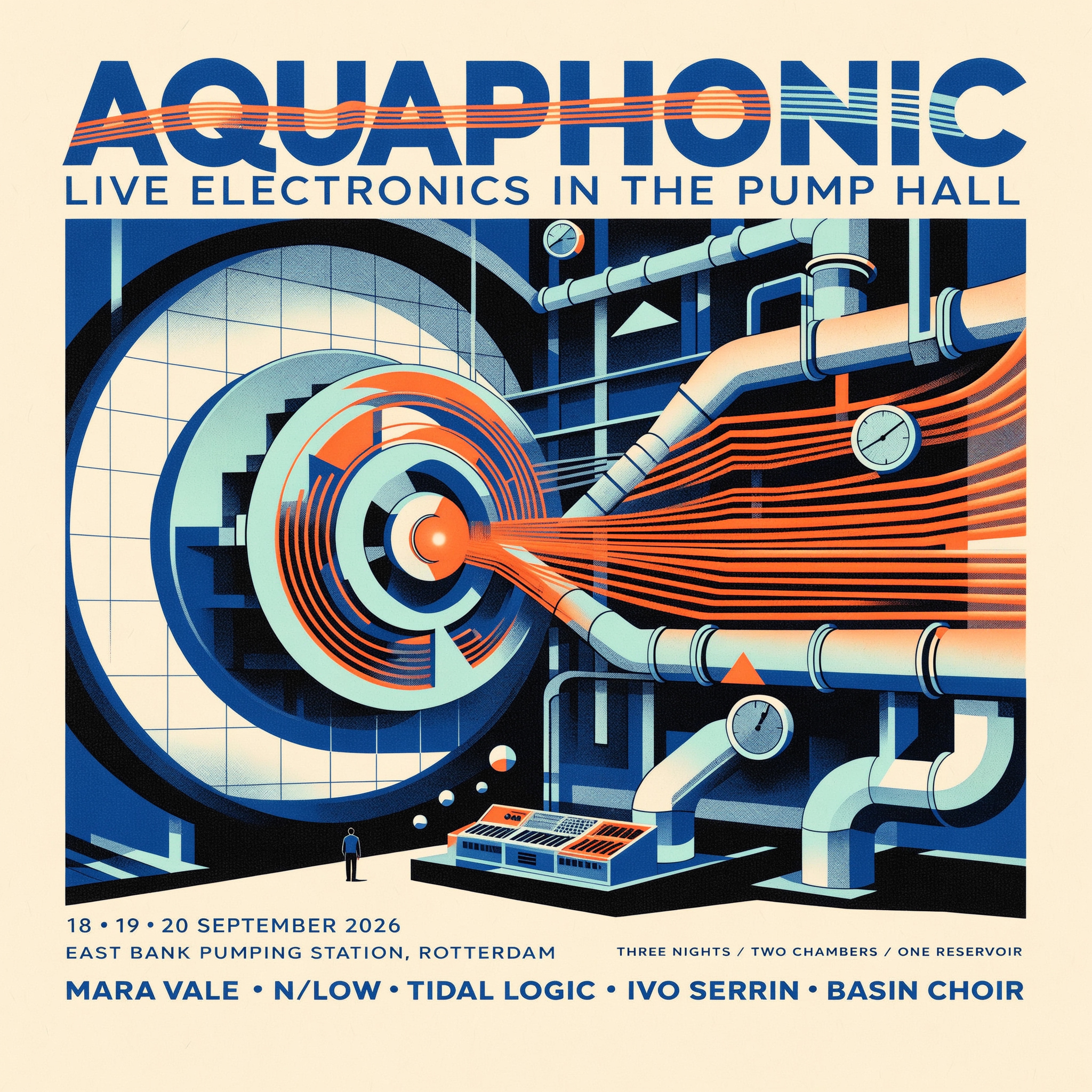
Create a finished square concert poster for AQUAPHONIC, a three-night experimental electronic music and hydrophone festival held inside a historic municipal pumping station. Use the three reference images only as a coherent visual-style guide: retain their premium screenprinted character, restricted cobalt blue, fluorescent orange, pale aqua, near-black and warm off-white palette, architectural geometry, technical-diagram precision, coarse halftones, tactile paper grain, translucent overprints and slight ink misregistration. Do not reproduce the reference subjects or their compositions. The original central image is a dramatic cutaway of an enormous circular water-pump impeller inside a cavernous tiled pump hall. Transform the impeller into a bold abstract sound symbol: concentric ripples radiate from its hub, pipework becomes rhythmic waveform lines, and a tiny lone performer stands at a modular synthesizer console near the bottom to establish monumental scale. Add a few crisp bubbles, pressure-gauge marks and diagrammatic arrows as graphic accents. Keep the composition energetic but highly controlled, with generous negative space and a strong diagonal flow. The mood is nocturnal, industrial, cerebral and electric rather than dystopian. Typography is essential and must be clear, intentional and integrated into the artwork. Set the main title AQUAPHONIC in huge condensed uppercase sans-serif lettering across the upper third, with selected letters interrupted by ripple lines while remaining legible. Below it, set LIVE ELECTRONICS IN THE PUMP HALL in smaller uppercase type. Include the event information in a clean modular grid: 18–20 SEPTEMBER 2026; EAST BANK PUMPING STATION, ROTTERDAM; MARA VALE • N/LOW • TIDAL LOGIC • IVO SERRIN • BASIN CHOIR. Place DOORS 19:00 and THREE NIGHTS / TWO CHAMBERS / ONE RESERVOIR as small supporting details. Use only this requested copy, with no logos, web addresses, QR codes, ticket buttons or mockup surroundings. Presentation-ready contemporary arts-festival poster, visually balanced at 2048x2048, edge-to-edge standalone artwork, crisp hierarchy, refined detail, convincing screenprint texture and excellent readability.
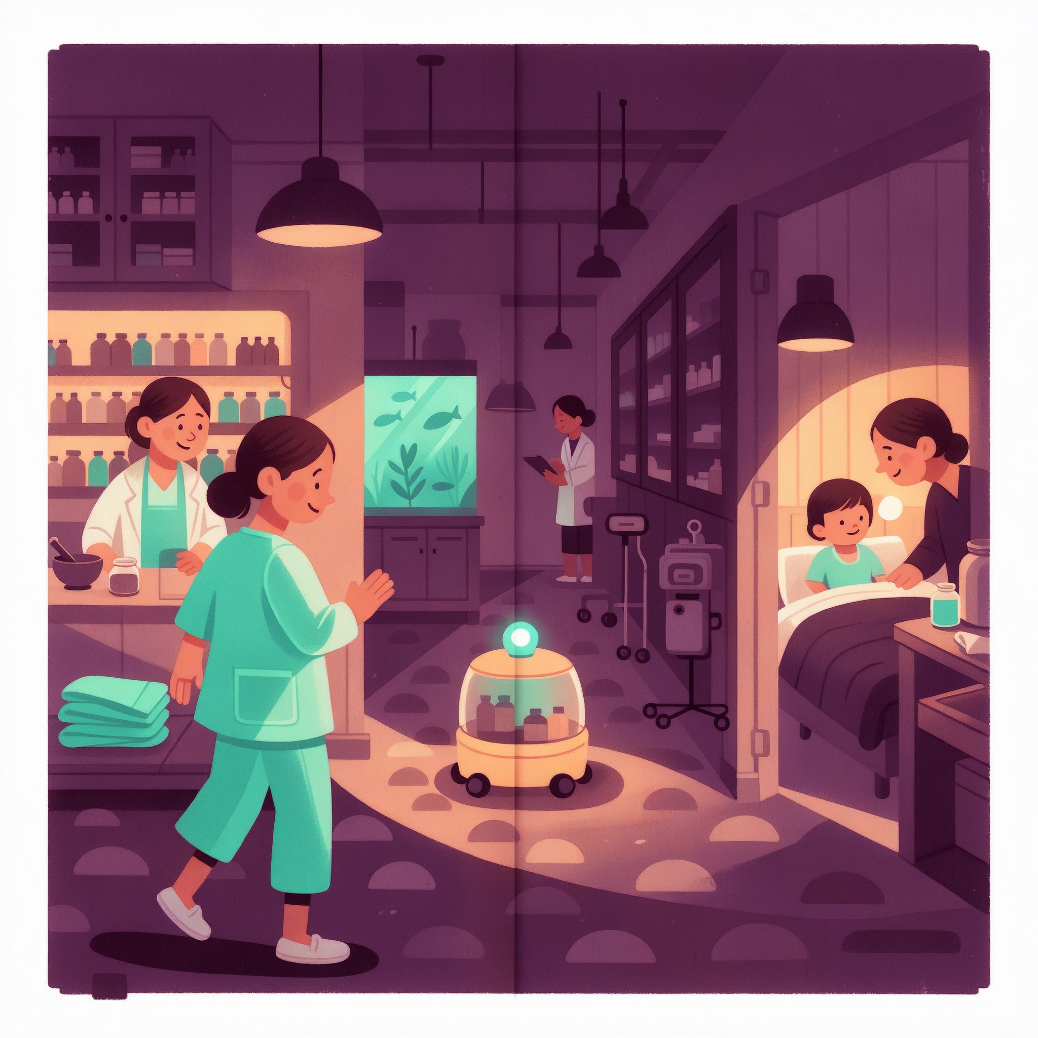
Create one polished square double-page children’s-book spread for a pediatric hospital’s welcome book, using all three reference images only as a coherent visual-style guide. Preserve their shared screen-printed gouache and cut-paper language, chunky simplified silhouettes, tactile dry-brush grain, slight ink misregistration, expressive faces, layered architectural depth and restrained aubergine, apricot, mint and cyan palette. Do not reproduce any people, places, objects or compositions from the references. New original subject: a calm children’s hospital during the night shift. Show a friendly waist-high medicine delivery robot traveling from the pharmacy on the left toward a young patient’s room on the right. The robot is practical rather than humanoid: rounded yellow body, softly glowing cyan status light, secure transparent medicine compartment and small wheels. A warm, attentive nurse walks beside it. Build a continuous left-to-right visual journey through the corridor: a pharmacist waves from a softly lit dispensary window, the robot passes a moonlit aquarium alcove and patterned floor markers, then arrives at an open patient room where an awake child sits comfortably in bed with a parent nearby. The child looks curious and reassured, not ill or frightened. Include subtle signs of caring night-shift teamwork such as neatly parked equipment, folded blankets and another staff member checking a clipboard in the distance. Compose specifically as a 2048x2048 square picturebook spread with a vertical center gutter. Keep faces, the robot and all essential storytelling details safely away from the gutter. Let the robot’s curved floor path guide the eye across both pages. Reserve quiet, uncluttered shapes in the upper-left and upper-right for later editorial typesetting, but include no written words, letters, numbers, signage, logos or watermarks in the image. Warm pools of apricot light should contrast with cool aubergine nighttime corridors and cyan moonlight. Child-friendly, emotionally reassuring, sophisticated enough for a professionally published hospital picture book, crisp presentation-ready detail with handmade print texture.
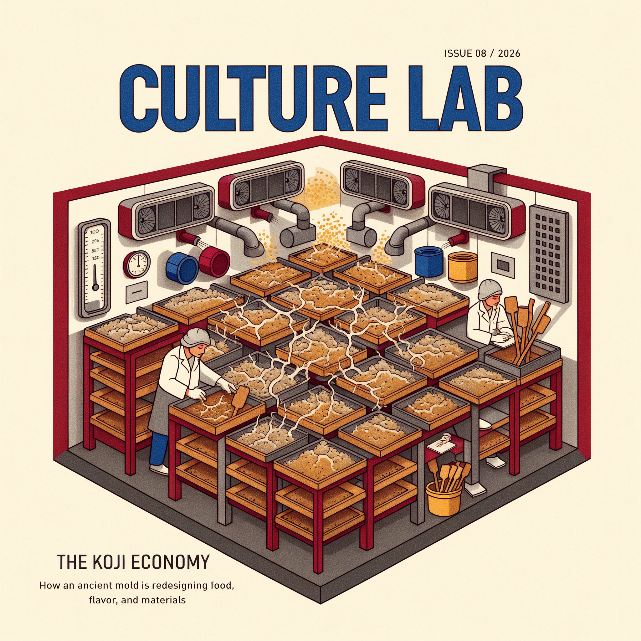
Create a finished square magazine cover for CULTURE LAB, an independent quarterly about fermentation science and manufacturing. Use the three reference images only as a coherent visual-style set: preserve their shared rendering language, tactile paper texture, layered gouache forms, crisp ink contours, selective risograph halftones, disciplined geometric composition and restrained oxblood-red, saffron-yellow, cobalt-blue, charcoal and warm-cream palette. Do not reproduce any clocks, baggage systems, kilns, layouts or other reference content. New original cover subject: a dramatic bird's-eye cutaway of a modern koji fermentation room. Stainless-steel racks hold dozens of shallow cedar trays filled with rice inoculated by Aspergillus oryzae. Fine branching white mycelium spreads across the trays as elegant map-like networks, visually connecting the room into one living production system. Two small technicians in clean white workwear inspect trays and record temperature readings, providing scale without becoming the focal point. Include ventilation ducts, humidity gauges, cedar paddles and subtle clouds of golden spores, all scientifically plausible and carefully organized. The central rack formation should feel both biological and architectural, like a microbial city, with dense detail that remains legible at cover size. Design this as a flat, print-ready editorial cover, not a photographed magazine mockup. Reserve the upper band for a large, clean masthead reading exactly “CULTURE LAB” in bold condensed cobalt sans serif capitals. Add small text above or beside it reading exactly “ISSUE 08 / 2026”. Place the main cover line in the lower-left quadrant, clearly readable and not covering the technicians: “THE KOJI ECONOMY”. Beneath it, in smaller type, add exactly “How an ancient mold is redesigning food, flavor, and materials”. Use strong typographic hierarchy, generous margins, an intelligent independent-publishing sensibility and crisp professional alignment. No barcode, no price sticker, no extra cover lines, no logos, no illegible filler text. Mood: rigorous, tactile, quietly optimistic and future-facing rather than whimsical. Full-bleed square composition with polished detail suitable for a premium science and food-culture quarterly.