Ideogram 4.5
Request
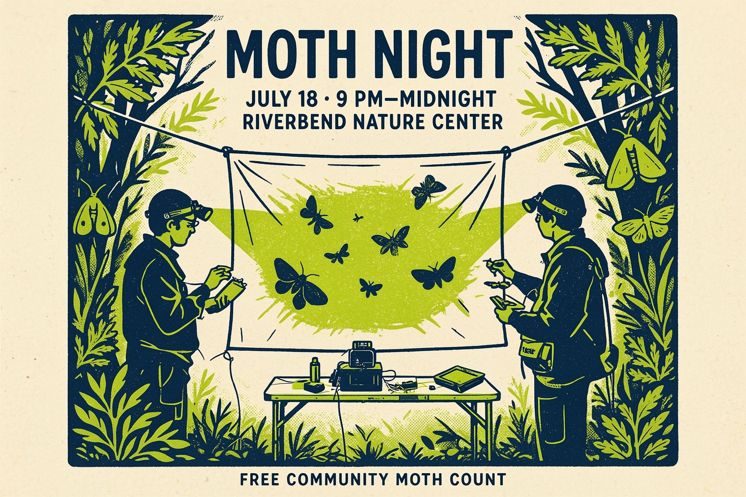
Edit the first reference image into a finished landscape social media event graphic for a nature center while preserving its recognizable composition: retain the exact centered moth sheet, the two biologists in their original positions and poses, the equipment table below, the surrounding tree shapes, and the original straight-on framing. Transform the photograph into the visual language of the second reference image: a bold two-color silkscreen print on warm cream recycled paper, deep midnight blue shadows, fluorescent chartreuse highlights, simplified botanical silhouettes, visible halftone dots, tactile paper grain, and subtly imperfect ink registration. Keep the people natural and clearly identifiable as field biologists rather than turning them into abstract figures. Make the illuminated sheet the brightest focal point and add several accurately shaped moth silhouettes around its light. Use the open upper area for clean, highly legible event typography. Set the exact headline “MOTH NIGHT” in large condensed uppercase lettering, followed by “JULY 18 · 9 PM–MIDNIGHT” and “RIVERBEND NATURE CENTER” in smaller uppercase type. Add the short footer “FREE COMMUNITY MOTH COUNT” along the bottom edge. Integrate the lettering as part of the silkscreen design, with strong hierarchy, generous spacing, and no extra words. Energetic, educational, welcoming, slightly mysterious nighttime mood. Professional campaign artwork ready to publish as a standalone social media post, edge-to-edge design only, not shown inside a phone, app, browser, frame, or mockup; no logo and no clickable button.
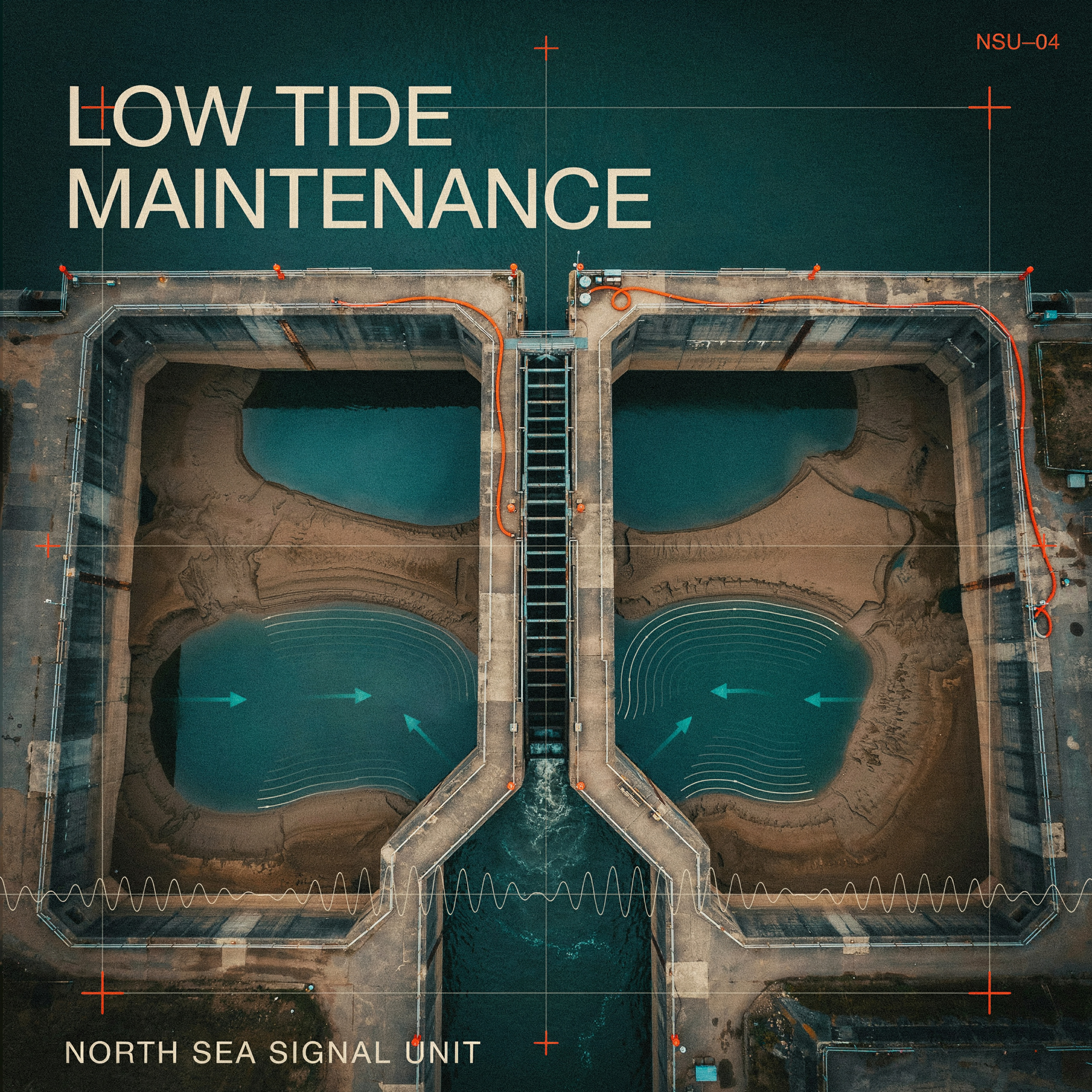
Create a finished square album cover for an experimental industrial-ambient record assembled from hydrophone recordings and maintenance sounds captured at a North Sea storm-surge barrier. The cover must feel like a commissioned release from a discerning independent electronic label, not a mockup. Visual content: an austere overhead view of a vast concrete tidal gate at low tide, reduced to bold geometric forms. A narrow steel maintenance ladder descends through the center into dark rippling water; tiny safety-orange inspection markers and cable lines establish scale. Merge documentary industrial photography with screen-printed technical diagrams: subtle depth contours, current-direction arrows, registration crosses, measured grid lines, and a faint waveform derived from moving water. Strong negative space, crisp hierarchy, tactile uncoated-paper texture, restrained halftone grain, slightly imperfect ink registration. Palette limited to deep oxidized teal, wet silt brown, warm bone, black, and vivid safety orange. Mood: cold, precise, maritime, meditative, quietly ominous. Typography is essential and must be highly legible. Set the exact album title “LOW TIDE MAINTENANCE” in large condensed uppercase sans-serif lettering, stacked across the upper-left quadrant with confident editorial spacing. Set the exact artist name “NORTH SEA SIGNAL UNIT” in smaller uppercase monospaced lettering along the lower-left edge. Add the exact catalog number “NSU–04” in tiny type at the upper-right. Integrate the lettering into the grid while preserving strong readability at thumbnail size. Use no other words, letters, numbers, logos, stickers, borders, or advisory labels. Flat, front-facing cover artwork filling the entire 2048 by 2048 canvas; no vinyl record, jewel case, frame, hands, room setting, perspective presentation, app interface, or product mockup.
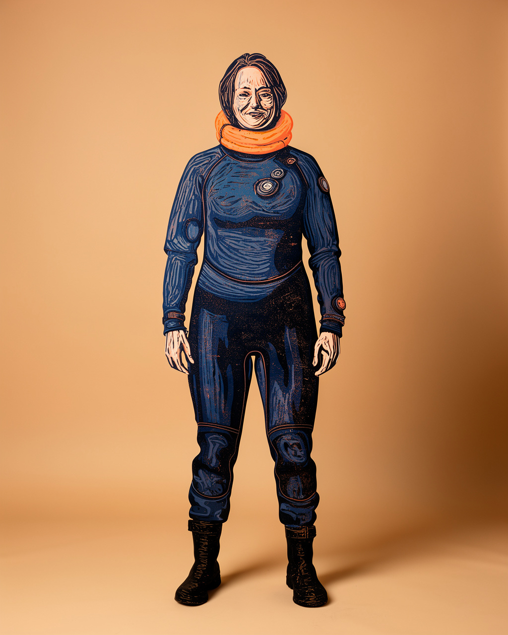
Edit only the masked archaeologist, transforming her entire photographic figure into a sophisticated hand-carved reduction linocut illustration for an oceanographic institute annual report. Preserve her exact identity, facial expression, stance, proportions, silhouette, clothing design, folded hood, placement, and scale. Render the figure with bold carved contours, expressive directional gouge marks, tactile ink texture, and carefully registered overlapping blocks in deep marine navy, oxidized copper, muted coral, and warm ivory. Keep the face recognizable and dignified, using restrained carved hatching rather than photorealistic skin. The result should feel like a contemporary museum-quality print commissioned to celebrate field science: graphic, human, precise, and materially rich. Preserve every unmasked part of the original photograph exactly, including the continuous sand-colored studio background, lighting, floor transition, grounded shadow, framing, and empty space. Do not alter or illustrate the background. No added objects, symbols, marine life, borders, typography, logos, labels, or signatures.
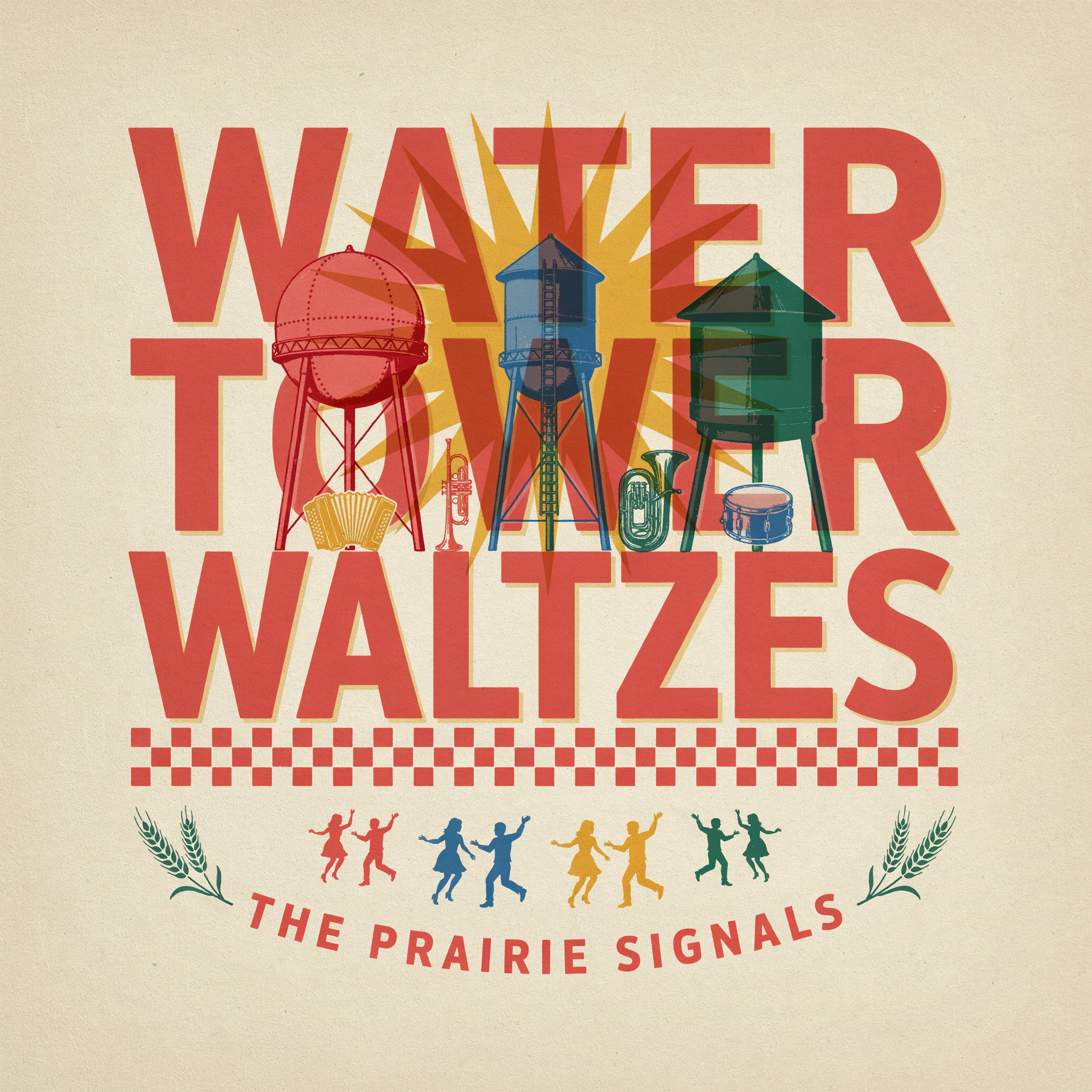
Create a finished square album cover for a contemporary Midwestern brass-and-accordion dance record. The visual concept celebrates small-town water towers as cheerful regional landmarks. Use bold vernacular typography and a flat, meticulously registered screen-print aesthetic inspired by vintage community dance posters, agricultural seed packets, and geometric quilt blocks, while remaining entirely original. The exact main title must read: “WATER TOWER WALTZES”. Set it in enormous condensed slab-serif capitals across the upper half, perfectly legible and correctly spelled. Arrange the words as three tightly stacked lines, using the letterforms as the main architecture of the composition. The exact artist name must read: “THE PRAIRIE SIGNALS”. Place it in smaller arched capitals along the bottom. Include no other words or lettering. Below and partially interwoven with the title, depict three distinct small-town water towers in simplified graphic silhouette: one classic riveted sphere on narrow legs, one tall cylindrical tank, and one squat vintage tank with a conical roof. Add a tiny accordion, trumpet, tuba, and snare drum arranged like decorative folk emblems between the tower legs. Suggest a lively outdoor summer polka with rhythmic zigzags, radiating sunbursts, wheat sprigs, checkered bands, and pairs of tiny dancing figures, all reduced to crisp emblematic shapes. Palette: warm uncoated paper cream, tomato red, cornflower blue, mustard yellow, and deep bottle green, with subtle ink overlap creating occasional secondary colors. Strong flat shapes, slightly imperfect screen-print edges, restrained paper grain, no gradients, no photorealism. Jubilant, neighborly, energetic mood. Balanced square composition with excellent hierarchy and generous outer margins. The lettering must remain dominant and readable at thumbnail size. Produce only the standalone front cover artwork, straight-on and edge-to-edge: no vinyl record, CD case, packaging mockup, room setting, frame, hands, stickers, logos, or extra text.