Nano Banana 2 Lite
Request
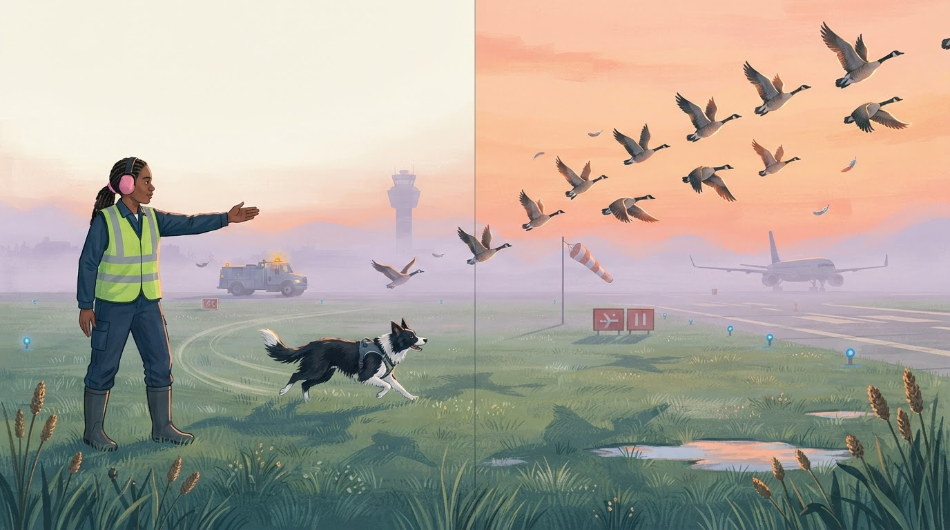
Create a finished full-bleed double-page illustration for a high-quality children’s nonfiction picture book about unusual airport careers. Show an airport wildlife biologist and her trained border collie safely guiding a flock of Canada geese away from the runway at dawn. The biologist is a confident Black woman in her late 30s, wearing practical navy field clothes, rubber boots, hearing protection, and a lime high-visibility vest; she stands on the grassy airfield infield and gives the dog a clear hand signal. The alert black-and-white border collie runs in a wide controlled arc through dew-covered grass, never touching the birds. The geese lift into the peach-colored morning sky in a sweeping diagonal formation that carries the reader’s eye from the lower left page toward the upper right page. In the distance, an airport operations truck waits with an amber beacon, a passenger jet remains stationary well behind the cleared runway line, and a control tower rises through thin lavender mist. Include believable airfield details: blue taxiway edge lights, low red-and-white guidance signs without legible lettering, a striped windsock, runway markings, puddles reflecting the sunrise, seed heads, and a few scattered feathers caught in the breeze. Make the work feel informative, humane, calm, and quietly heroic rather than chaotic. Art direction: sophisticated contemporary picture-book illustration combining opaque gouache, dry colored-pencil texture, and subtle screen-printed grain on warm off-white paper. Simplified but anatomically convincing people, dog, birds, aircraft, and airport equipment; expressive silhouettes; crisp visual storytelling; layered atmospheric depth. Palette of petrol blue, misty lavender, warm coral, apricot, cream, charcoal, and sharp chartreuse accents. Soft low sunrise creates long translucent shadows and glowing rims around grass and feathers. Use varied brush edges and tactile handmade texture while keeping important shapes clearly readable for children ages 6–9. Composition: one continuous panoramic scene across a 1376x768 landscape double-page spread, not separate panels and not a book mockup. Keep the central vertical gutter visually quiet, crossing only open grass and soft mist; do not place faces, the dog, or any bird directly on the fold. Position the biologist in the left third and the dog in the lower right third, with the flock forming the main overhead arc. Leave a calm patch of pale sunrise sky in the upper-left quadrant where an editor could later place copy, but include no typography in this generated artwork. Strong foreground, middle ground, and distant runway layers; child-height viewpoint; cinematic wide framing; publication-ready illustration. No title, captions, speech balloons, labels, logos, borders, page numbers, UI, watermark, or legible text.
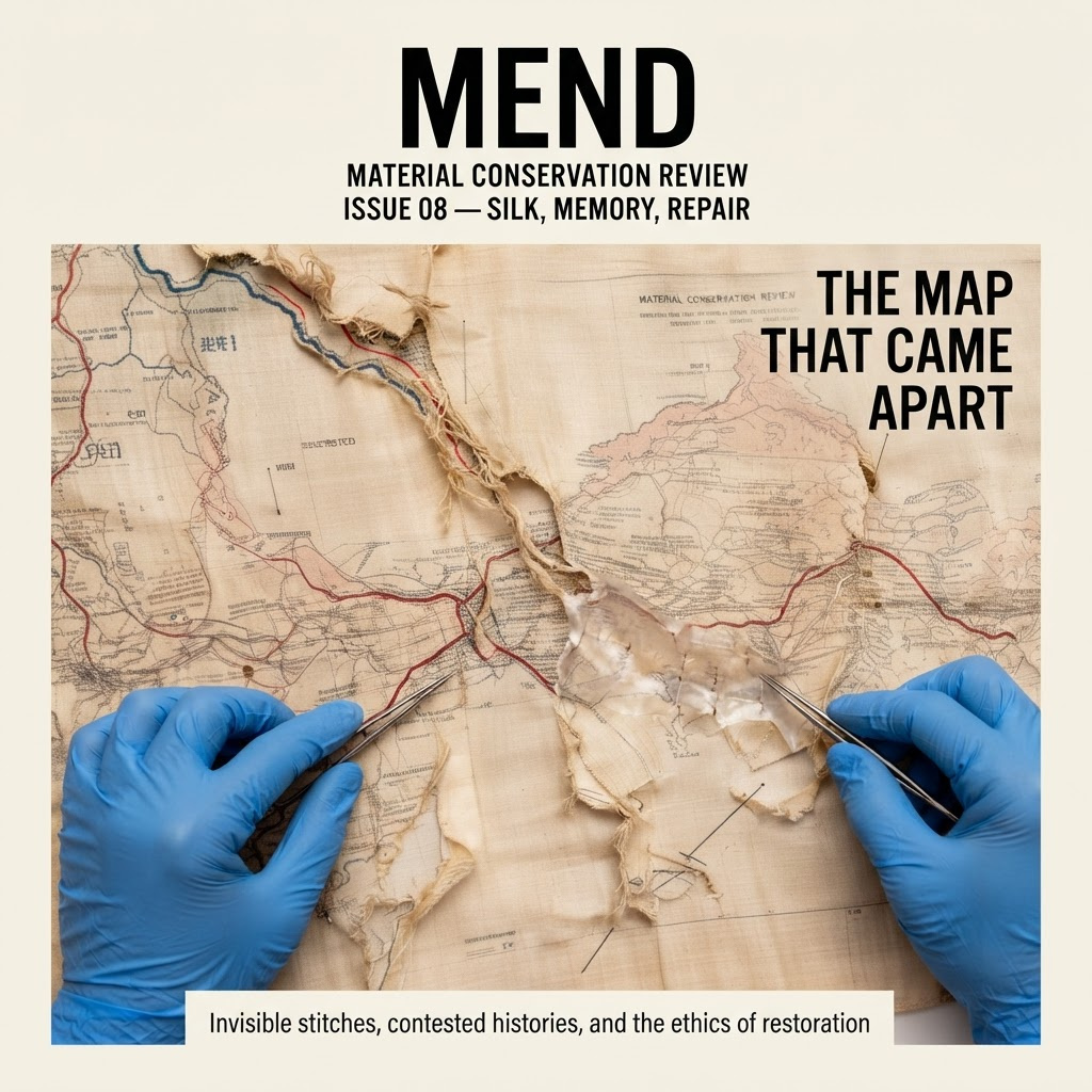
Create a new, finished square editorial cover for a respected professional journal about material and museum conservation. Ground the cover image closely in the two supplied reference photographs: retain the recognizable cream silk map, faded blue geographic linework, muted red route markings, frayed tears, translucent repair tissue, tiny stitches, and the conservator’s blue-gloved hands. Recompose these details into a bold overhead crop in which the hands enter from the lower left and right edges while a branching tear runs diagonally through the center like a river. The artifact must remain visibly delicate, tactile, and historically plausible. Art direction: rigorous contemporary European design journal, tactile archival photography combined with restrained screen-printed graphic interventions. Use warm ivory, ultramarine blue, signal red, and dense black. Apply a subtle coarse halftone only in selected shadow areas while preserving crisp fiber detail. Add one thin signal-red registration line that follows part of the central tear, suggesting repair analysis without resembling software UI. Calm, intelligent, materially focused mood; precise rather than nostalgic. Build a clear square cover hierarchy with generous negative space. At the top, set the large masthead exactly as: “MEND”. Directly beneath it, in much smaller uppercase type, set: “MATERIAL CONSERVATION REVIEW”. Add the issue line: “ISSUE 08 — SILK, MEMORY, REPAIR”. Place the main feature headline in the upper-right negative space across three short lines: “THE MAP / THAT CAME / APART”. Add one small supporting line near the bottom edge: “Invisible stitches, contested histories, and the ethics of restoration”. Use clean, condensed grotesque typography with accurate spelling, sharp alignment, and strong editorial restraint. Keep every line readable and separated from the artifact details. Deliver a single flat, print-ready cover image filling the entire frame. No book mockup, no magazine lying on a surface, no hands holding the finished cover, no spine, no barcode, no logos beyond the masthead, no browser interface, and no extra or repeated text.
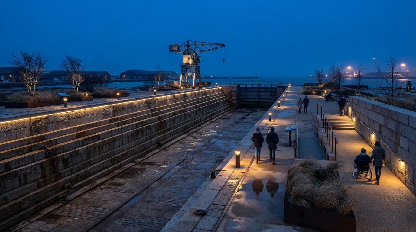
Create a finished photorealistic architectural lighting visualization for a municipal public-consultation presentation. Show a decommissioned 19th-century coastal dry dock newly adapted as a maritime heritage park at winter blue hour, immediately after sunset. The long empty dock basin is the central subject, seen from an elevated three-quarter viewpoint near the entrance so its monumental scale and stepped granite walls are clear. Preserve a credible working-waterfront character: weathered granite blocks, iron mooring rings, old rails embedded in the paving, a restored riveted gantry crane, the closed steel caisson gate, low harbor buildings and distant shipyard silhouettes. Demonstrate the proposed nighttime relighting scheme with precise, believable illumination: narrow warm-white linear fixtures concealed beneath the granite coping trace both sides of the dock; low shielded amber bollards mark a new accessible promenade; subtle grazing light reveals the rough masonry texture without overlighting it; restrained uplights emphasize the gantry crane’s riveted structure; soft recessed lights illuminate stair treads and handrails for safety. The warm 2700K lighting should contrast clearly with the cold cobalt-blue winter sky and blue-gray stone. Include small pools of rainwater on the dock floor and damp paving that produce realistic, understated reflections. A thin trace of sea mist hangs beyond the caisson gate. Add a few naturally spaced visitors in winter coats for scale: a couple walking along the promenade, one person reading an interpretive panel, and a wheelchair user accompanied by a friend. Keep people secondary and candid, with no one looking at the camera. Bare wind-shaped grasses in dark steel planters and sparse leafless coastal trees reinforce the season. Harbor work lights glow faintly in the far distance, while the heritage park remains calm, safe and inviting rather than theatrical. Compose as a wide 16:9 landscape image with strong leading lines running down the dry dock toward the harbor. Place the dock slightly off center, retain open sky above the crane, and show enough foreground promenade to communicate accessibility and material detail. Eye-level architectural photography realism, approximately 28mm lens, corrected verticals, deep focus, natural dynamic range, crisp stone and metal textures, physically plausible shadows, subtle atmospheric depth, premium planning-visualization quality. No snow, no dramatic storm, no fantasy elements, no excessive neon, no visible brand names, no legible text, no captions, no borders, no presentation board, and no interface.
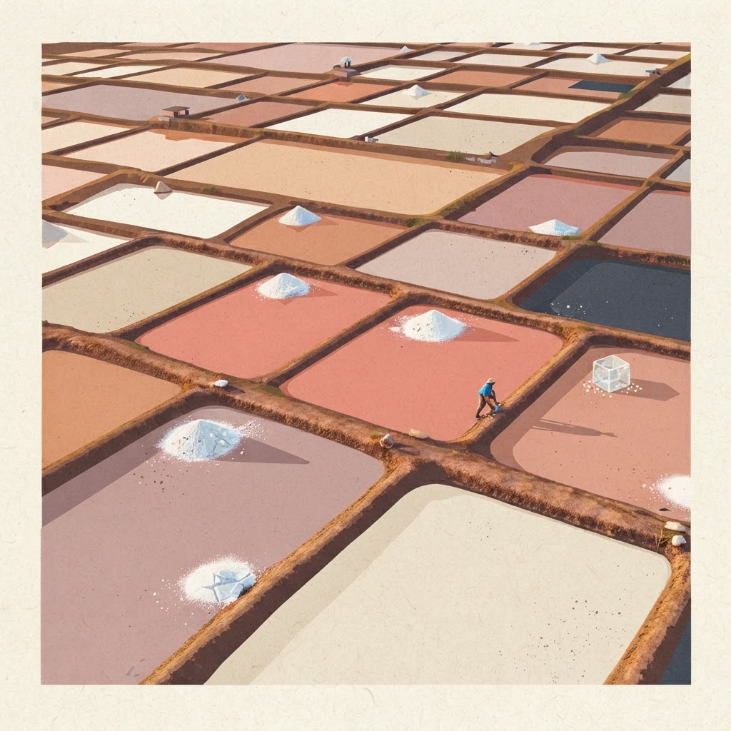
Create a new finished square wall-art image grounded in the supplied references. Preserve the first reference's recognizable aerial organization of working coastal salt ponds: irregular rectangular evaporation basins, thin earthen levees, shallow mineral-colored water, several small white salt piles, and a single tiny salt worker that provides scale. Reinterpret the scene as a sophisticated limited-edition reduction linocut combined with flat screenprinting, intended for the lobby and guest rooms of a design-led coastal wellness resort. Use the second reference to inform the tactile crystalline details: translucent cubic salt facets, chalky deposits, fractured mineral edges, and granular highlights should appear selectively within the printed textures without turning the landscape into fantasy. Compose specifically for a 1:1 square print. Use a calm, top-down-to-oblique viewpoint with the pond geometry flowing diagonally from lower left to upper right. Establish one large muted coral pond as the visual anchor near the center, surrounded by smaller basins in dusty rose, sun-baked terracotta, warm limestone, bone white, pale clay, desaturated mauve, and a restrained accent of deep charcoal-blue. Keep the human figure very small but legible, walking along a narrow levee beside a salt pile. Simplify forms into bold interlocking shapes while retaining the functional structure of a real saltworks. Art direction: collectible mid-century Mediterranean printmaking, crisp carved contours, subtle registration offsets, dry-ink grain, fibrous uncoated paper texture, sparse mineral speckling, balanced negative space, elegant asymmetry, quiet contemplative mood. Lighting should read as low late-afternoon sun through long graphic shadows rather than photorealistic glare. Maintain clear edges and strong tonal separation suitable for high-quality print-on-demand reproduction. No border, frame, room mockup, typography, captions, logos, symbols, watermark, or signature. Deliver only the standalone artwork.